
Design Brief
In this project, a song was chosen to be translated into two broadside posters. The first poster implemented a logotype of a keyword taken from the song that reflected the song's meaning or interpretation, and the second poster further pushed that meaning by integrating a photograph and the type of the song. Both posters were required to be based off of a postmodern grid, which should be a highlight of the dynamic compositions. All treatment of type and color should convey the meaning of the song to the audience.
Research
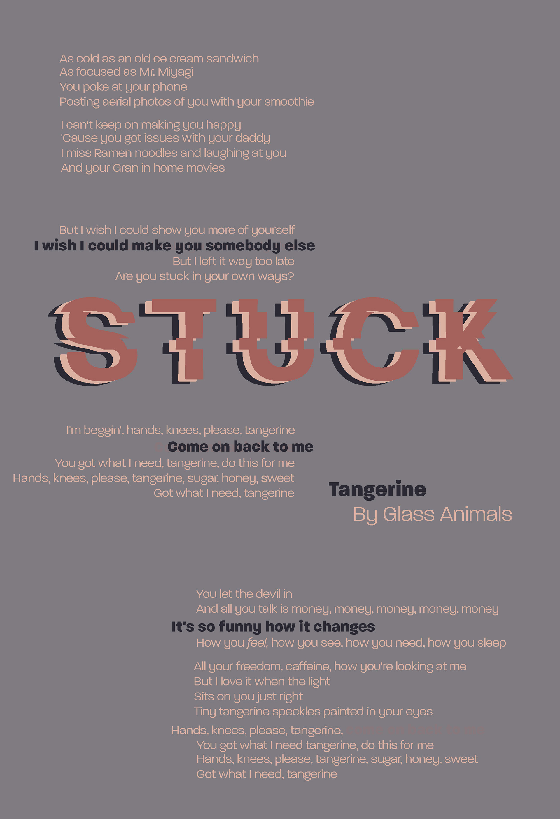
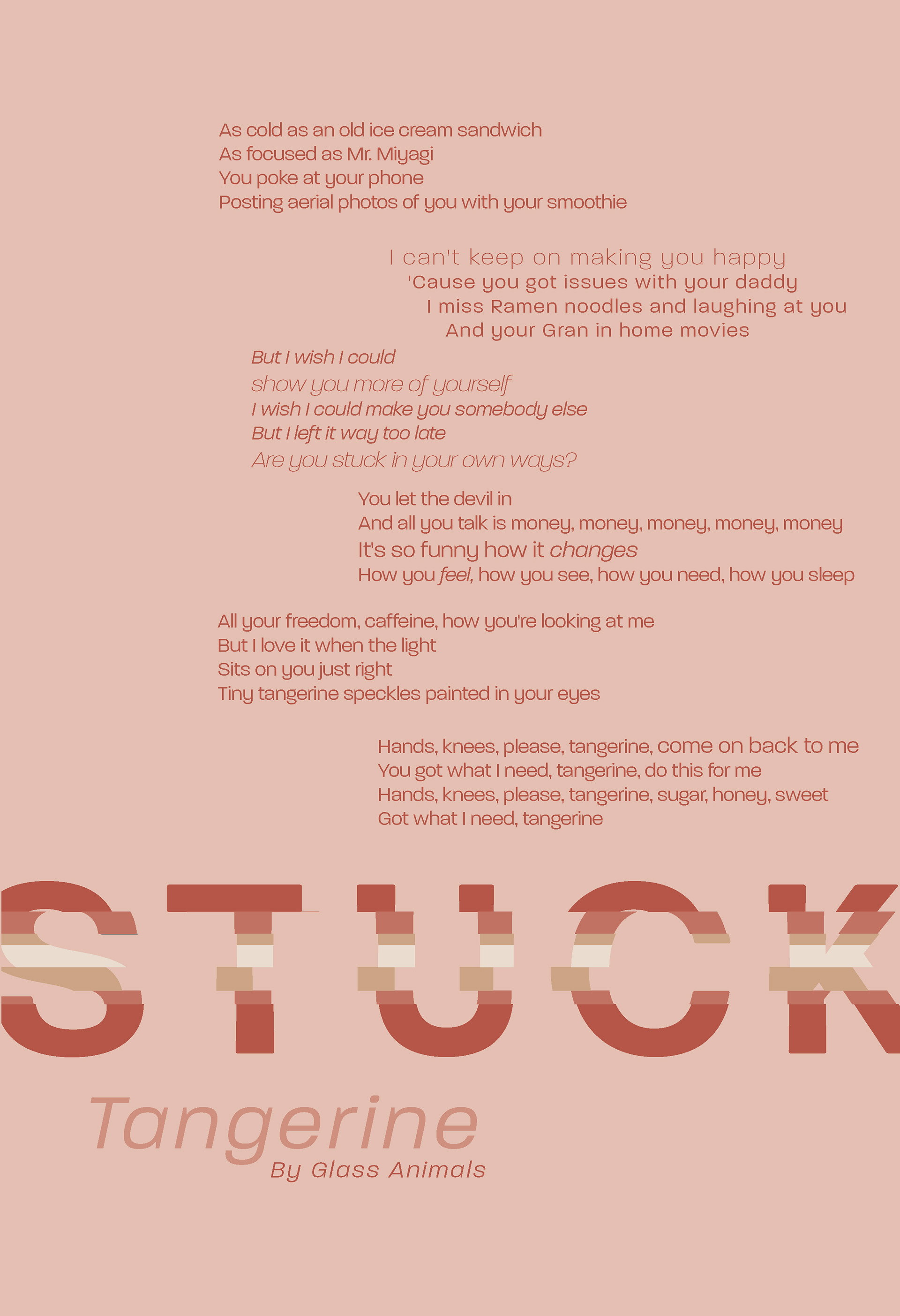
I chose the song "Tangerine" by Glass Animals, which walks through the difficulty of knowing someone for a long time and then seeing them change into someone else and not really liking the change. To represent this, I chose to use the word "stuck" to portray the interpretation of the song. That feeling of wanting to continue on but wanting to preserve the past and knowing you can't is perfectly summed up in this simple word. I researched all possible meanings, interpretations, and synonyms for the word and launched myself into exploring logotype design options.
Process
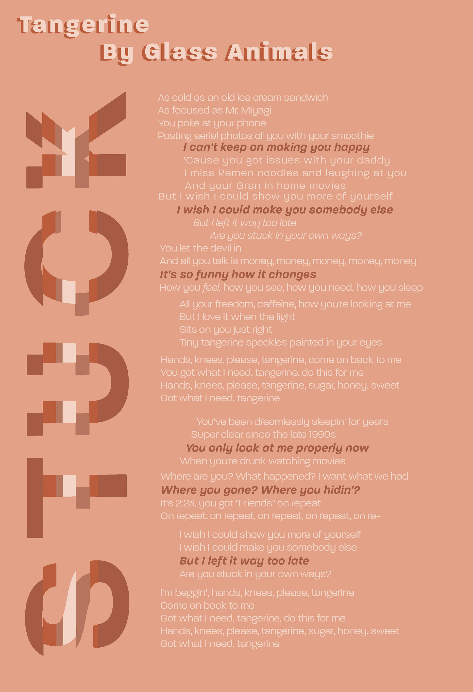
After exploring multiple options, I decided that my logotype would embody a glitching screen to denote the "stuck" aspect, but also to harken back to the retro callouts of the song. I segmented the individual letters of the word into equal horizontal cutouts, which I then recombined to make each horizontal segment uniformly displaced. The end result achieved the look of half of the word moving faster than the other half, similar to how a screen might displace pixels when glitching or stuck.
Systems
Paralucent
a b c d e f g h i j k l m n o p q r s t u v w x y z
A B C D E F G H I J K L M N O P Q R S T U V W X Y Z
1 2 3 4 5 6 7 8 9 0 ! @ # $ % ^ & * ( )
I initially explored colors that I pulled from images relating to the mood and atmosphere of the song. I landed on a muted purple and a cool earthy pink. These colors communicated the nostalgia of the past compared to the conditions of the present.
The Typeface I chose gives a clean, geometric contrast to the uneasy muffled colors. Additionally, the unique quirks of the joint of the lowercase "n" or the ear of the "a" allows for a distinctive, and somewhat retro 90's feel.
Explorations of Logotype Broadside

Postmodern Grid Application

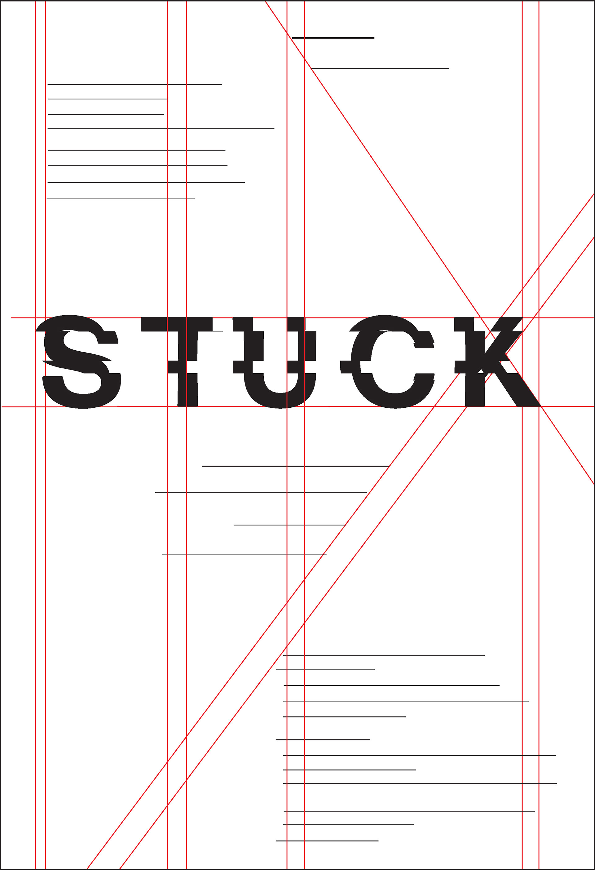
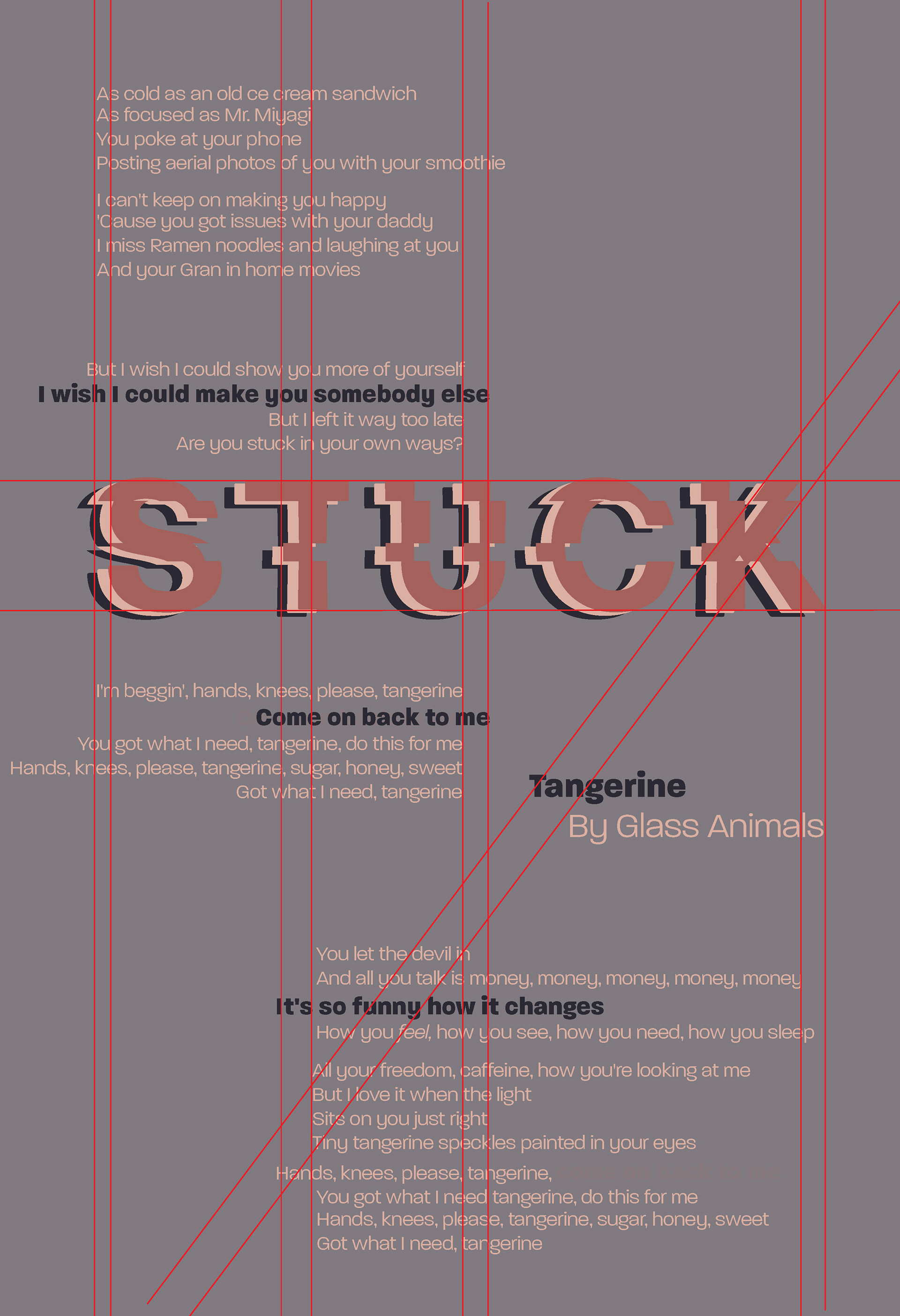
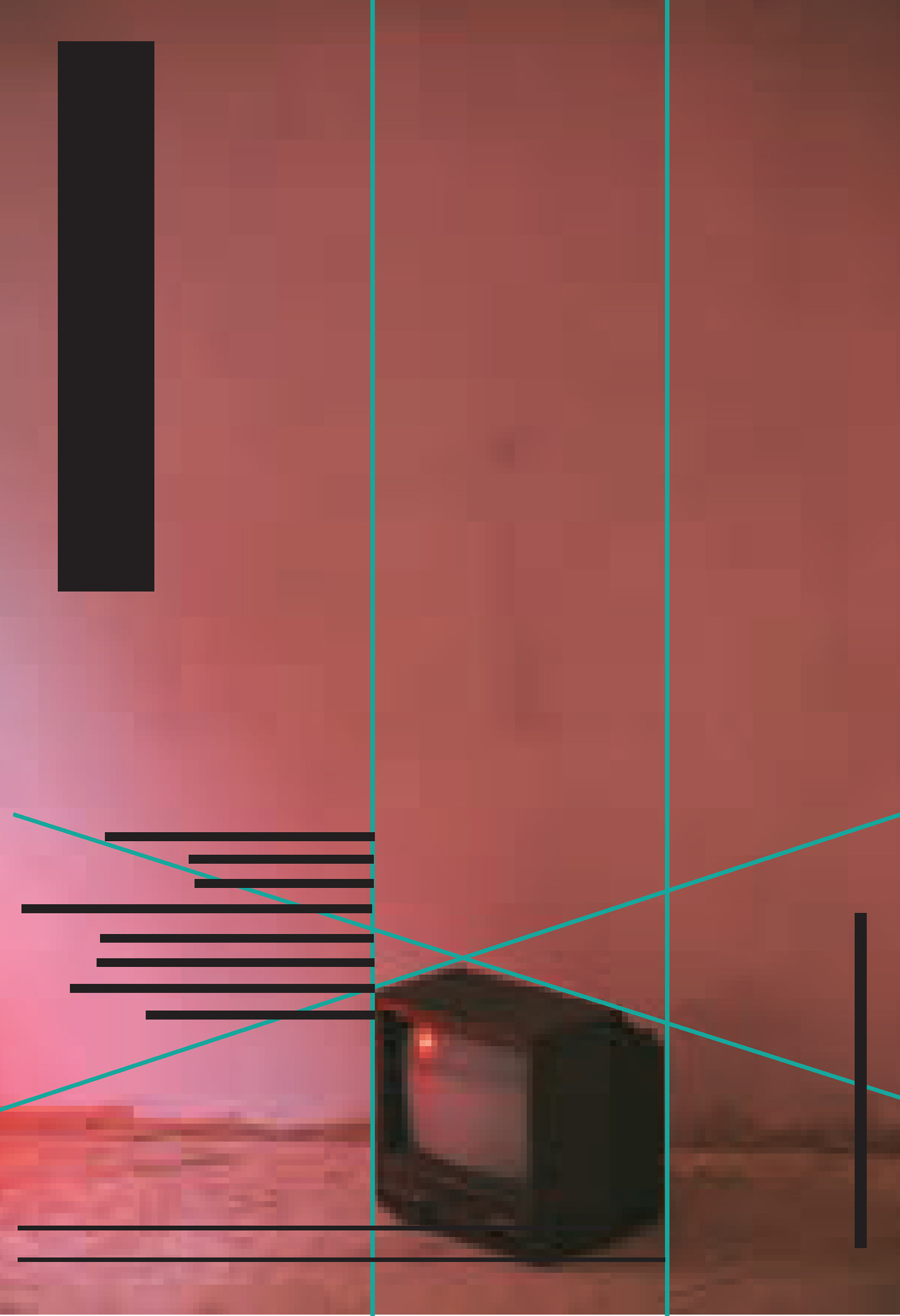
Initially, the grid lines were pulled from the main unique features of the logotype. From there, multiple thumbnail explorations were made, each focusing on different grid lines. A few of these thumbnails were chosen to further explore and develop, later adding color, dropping in the true lyrics, and experimenting with the logotype. The postmodern grid also allowed for further definition of the relationships between the lyrics and the hierarchy.
Image + Type Poster Explorations
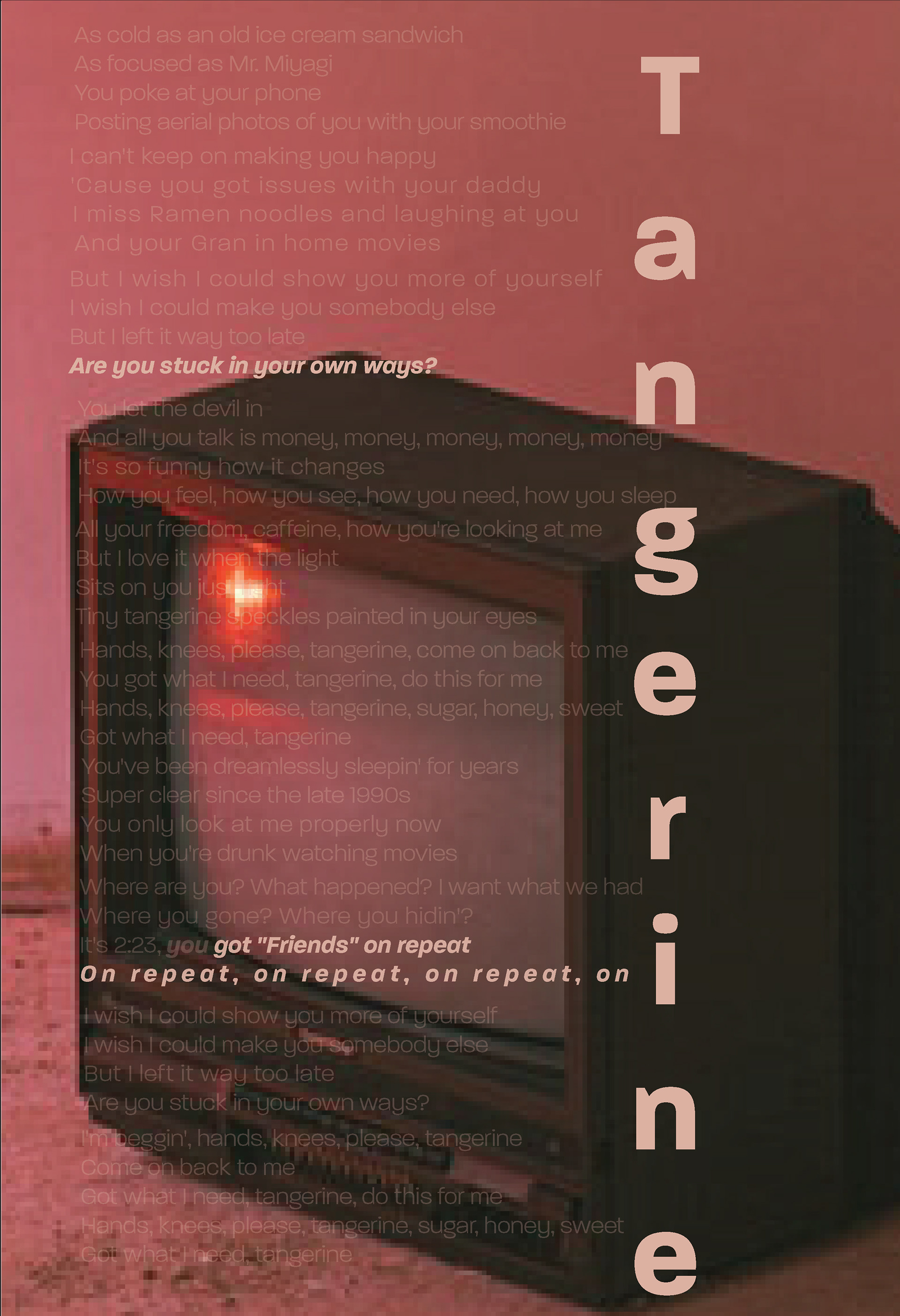
Postmodern Grid Application
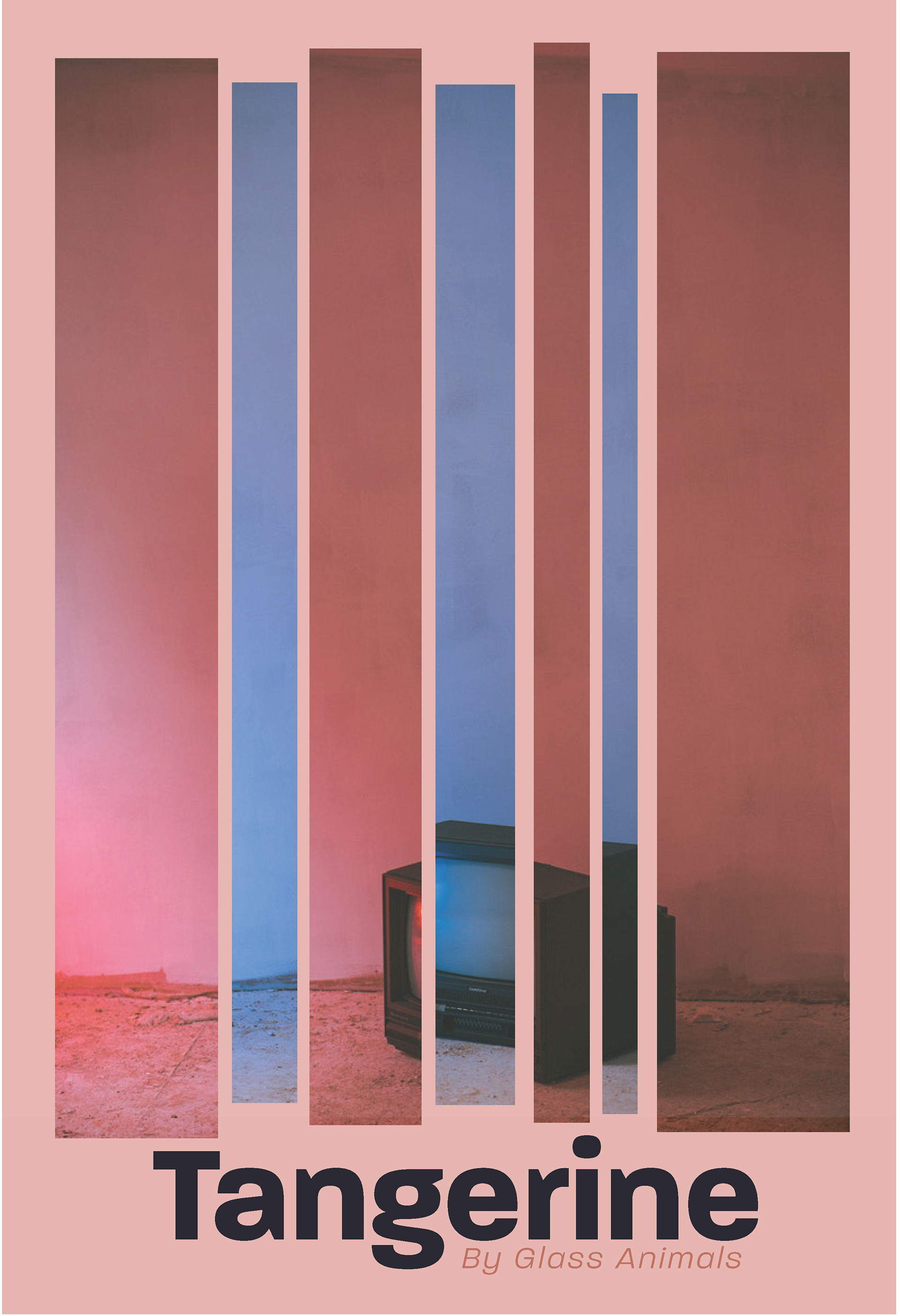
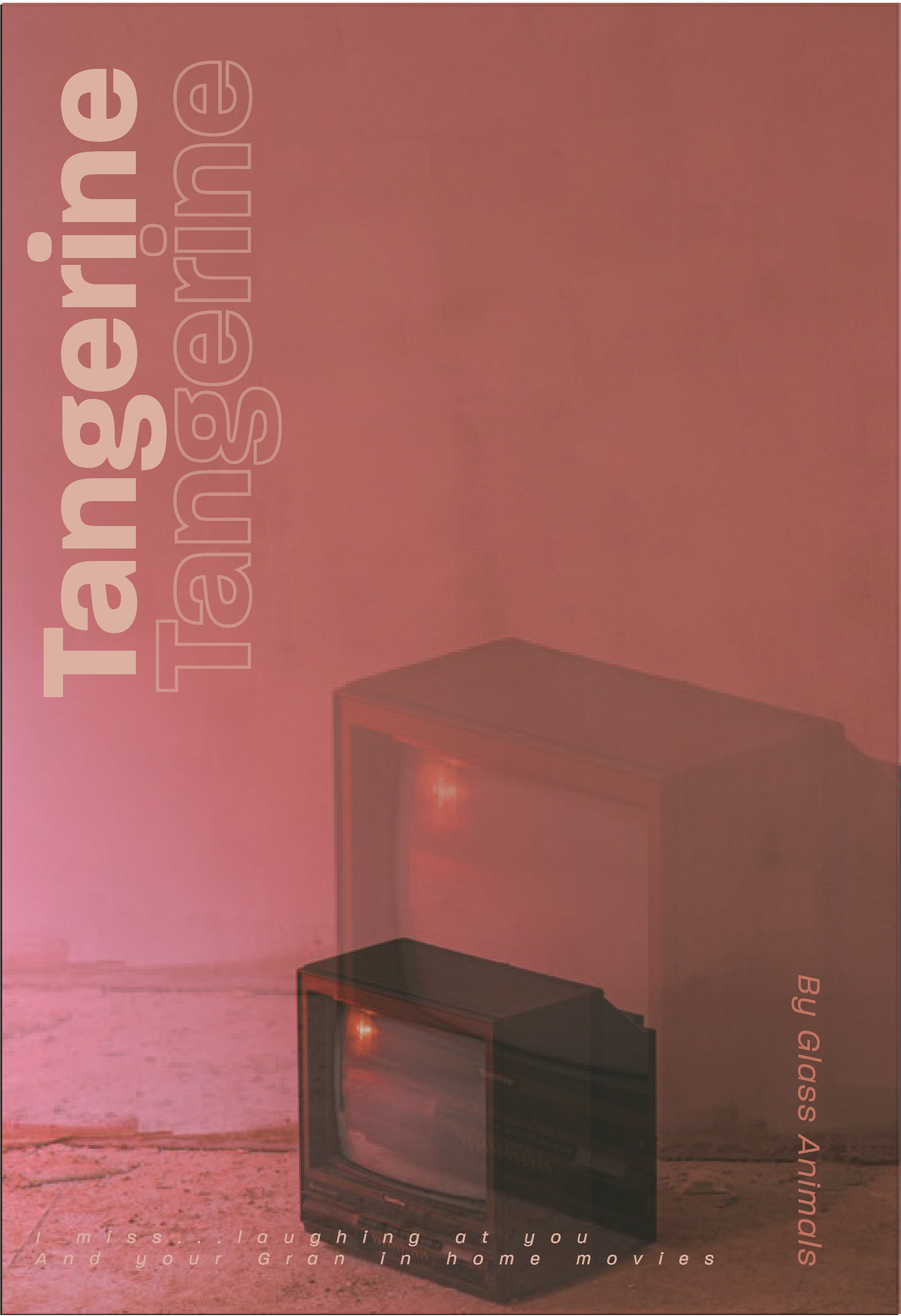
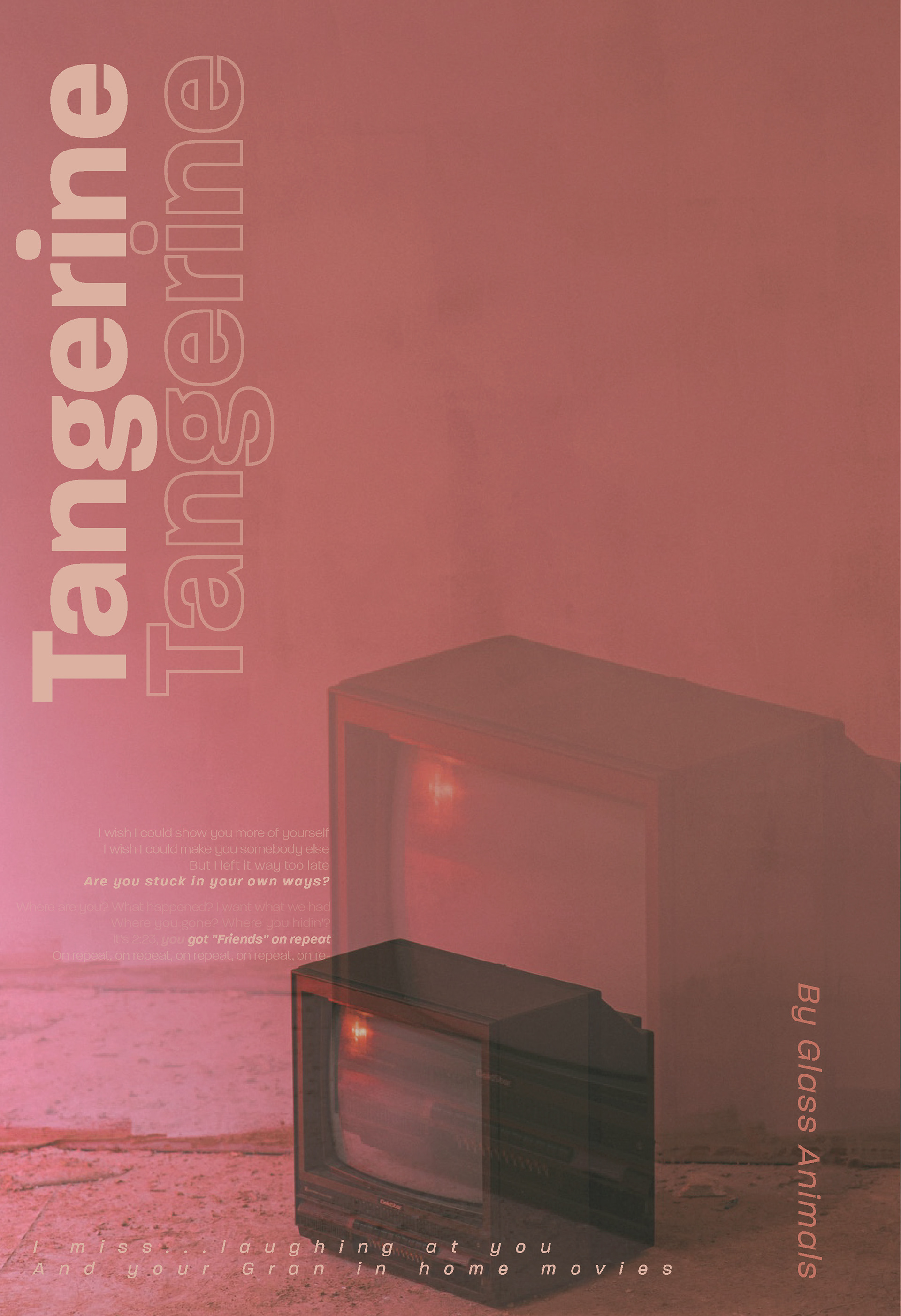
The methods for instituting and exploring layouts with the postmodern grid implemented with the photographic poster were the same as were used in the logotype poster. While I initially explored multiple pictures, I decided this retro TV fit into the atmosphere of the song. I eventually added a double exposure effect to the final poster, as I felt it further pushed the idea of looking back or not seeing clearly as portrayed in the lyrics of the song.

Final Application
