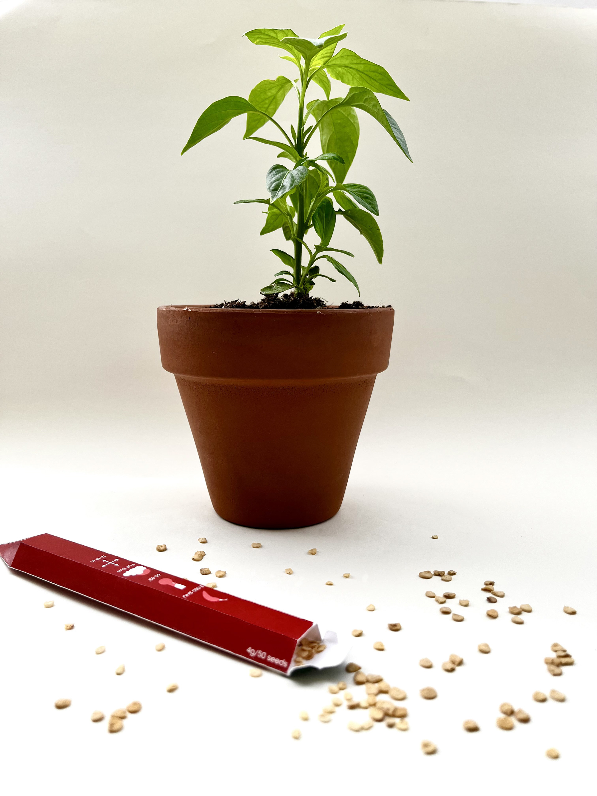
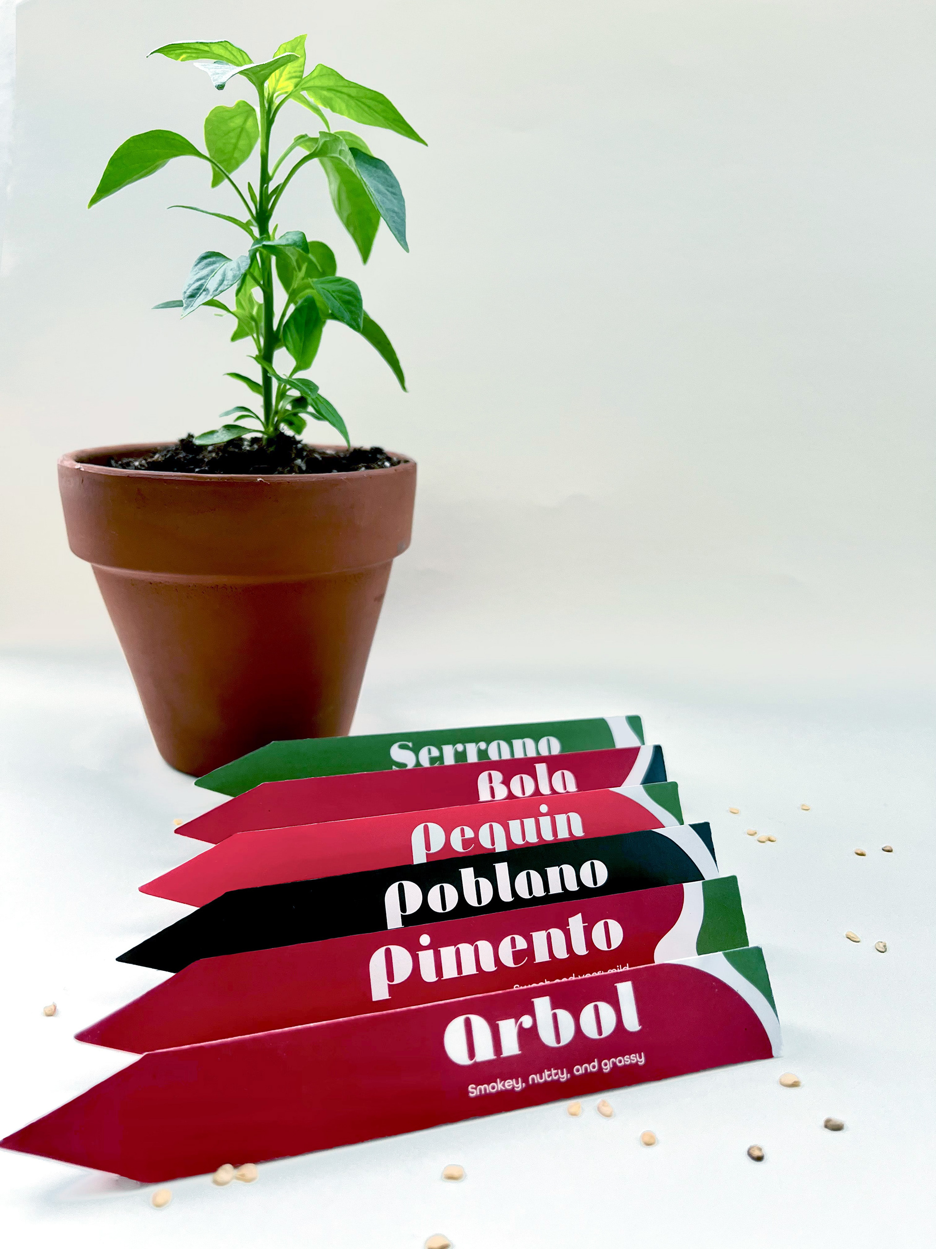
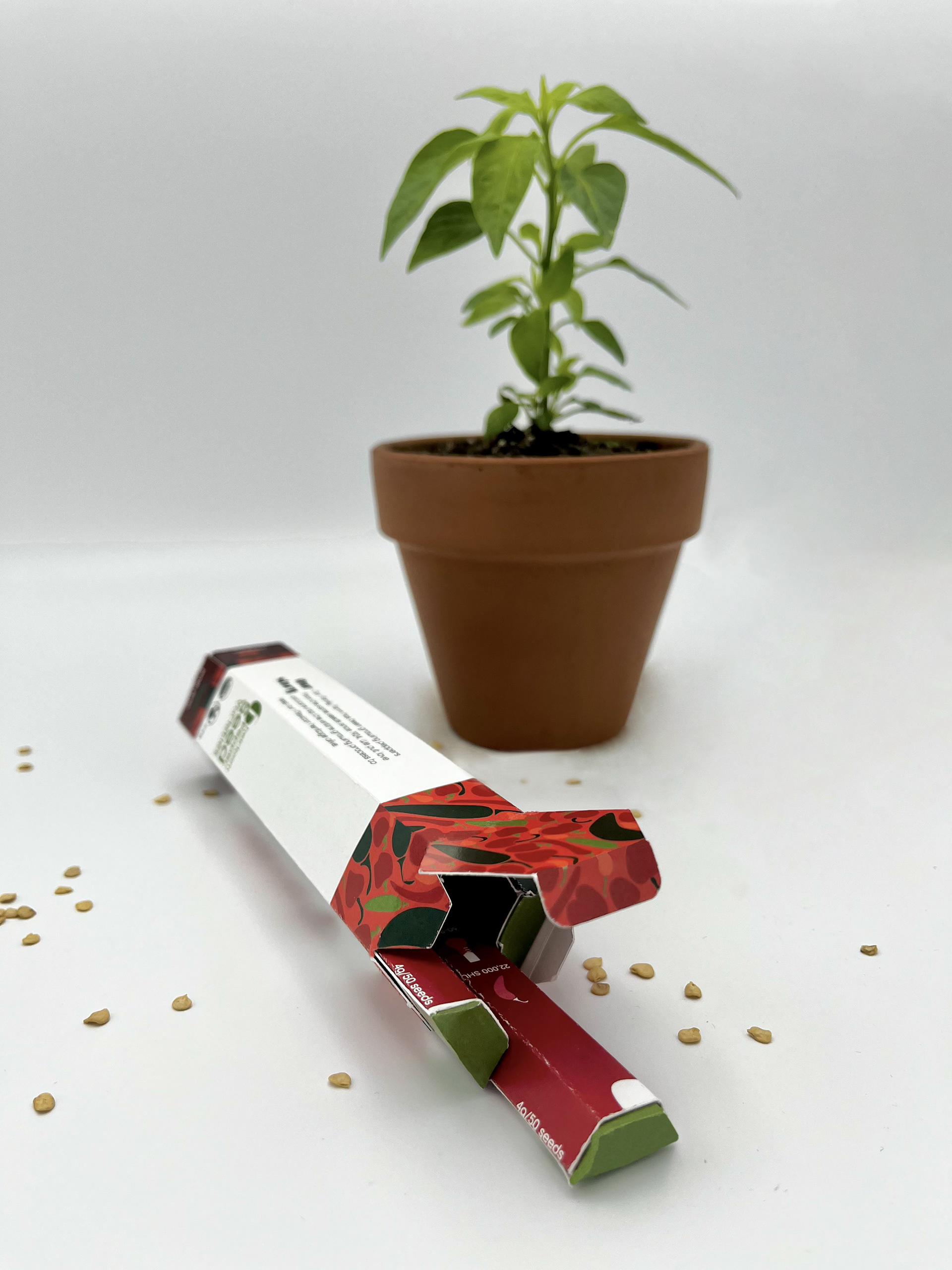
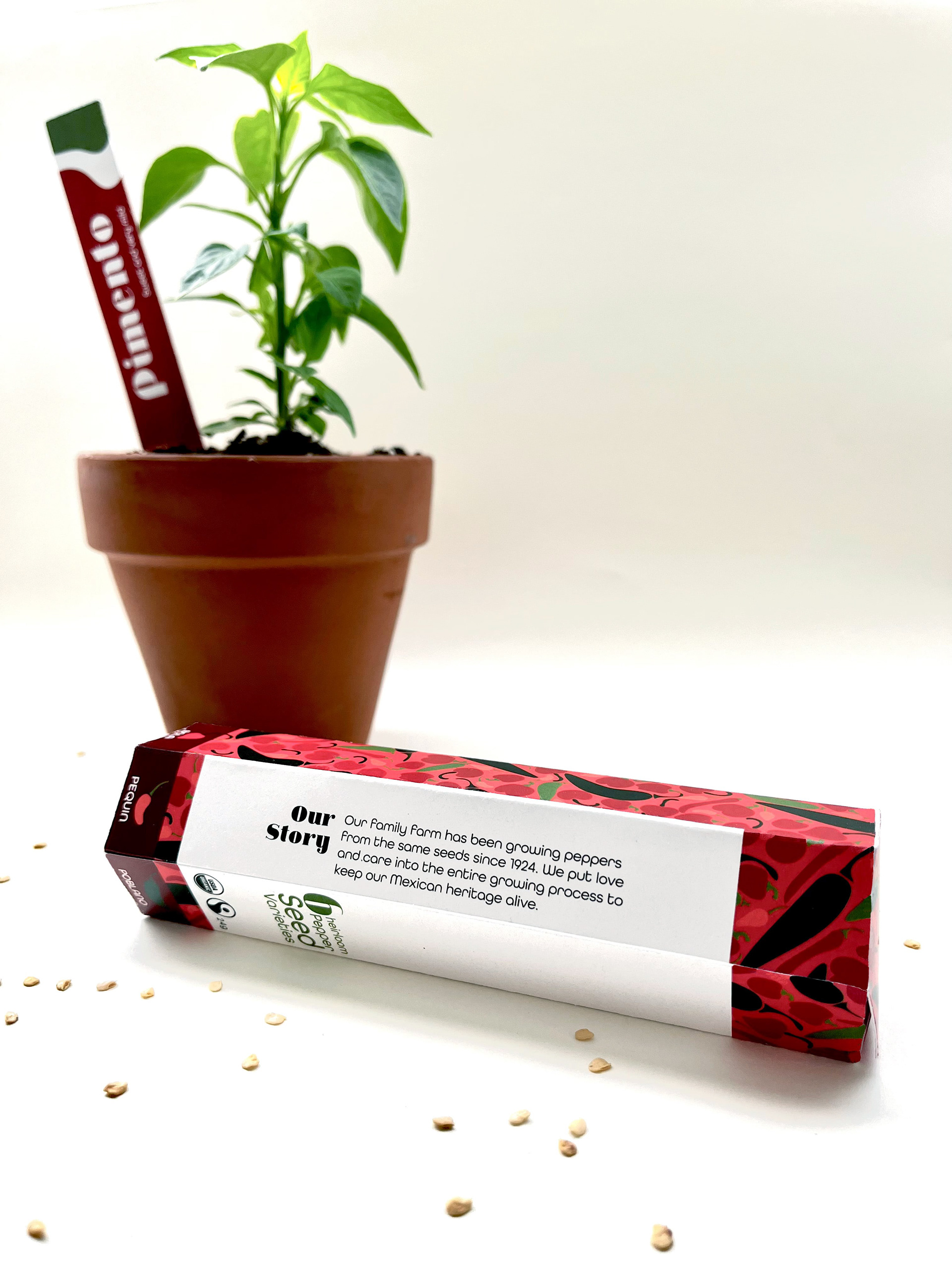
Salsa de la Vida is a fair trade, organic seed brand that sells heirloom Mexican pepper seeds. Their aim is to create sustainable, reusable packaging that looks attractive and encourages consumers to rethink their use of waste. Once emptied of their contents, the interior boxes become garden labels for each pepper variety. Additionally, they are printed on paper and are meant to eventually be recycled as compost when their use is worn down.
Personas
The main focus of the branding and marketing of this product was to create a starter pepper kit containing multiple different pepper seeds that could be grown indoors or outdoors and had little to no wasted packaging. As peppers are so resilient, this allowed the brand to target people living in a variety of housing situations, from a small apartment to a house with enough yard room for a garden.
Prototype
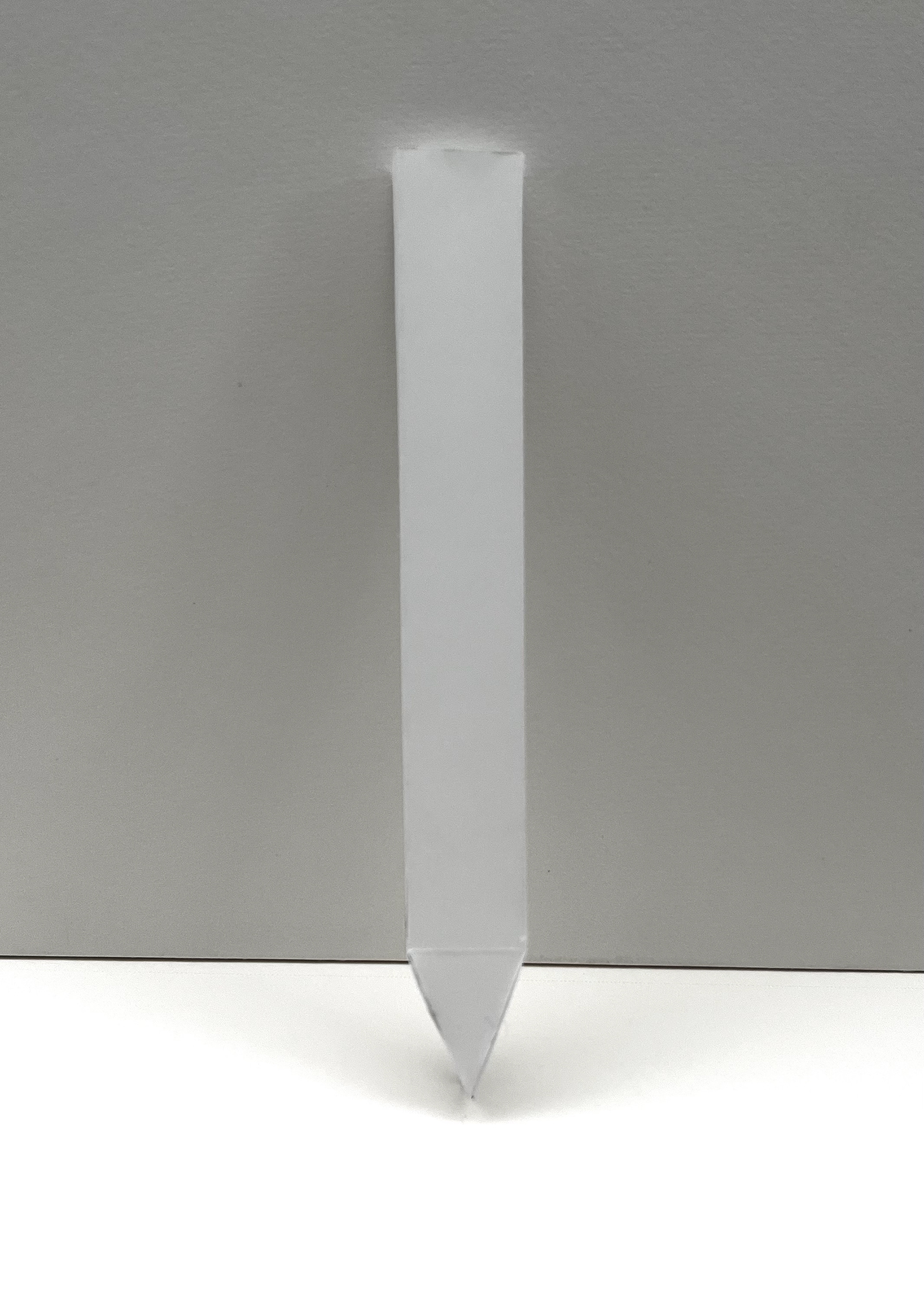
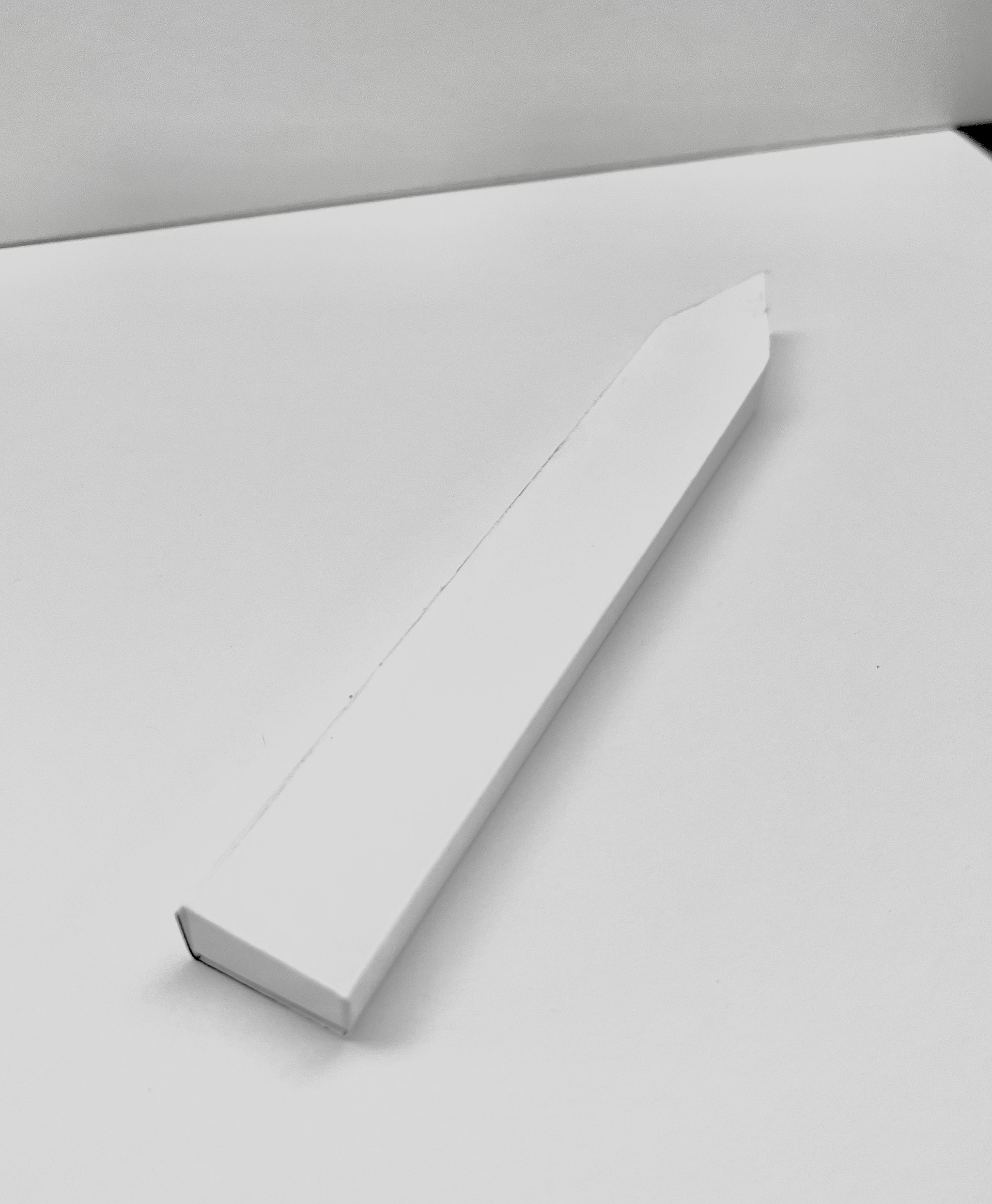
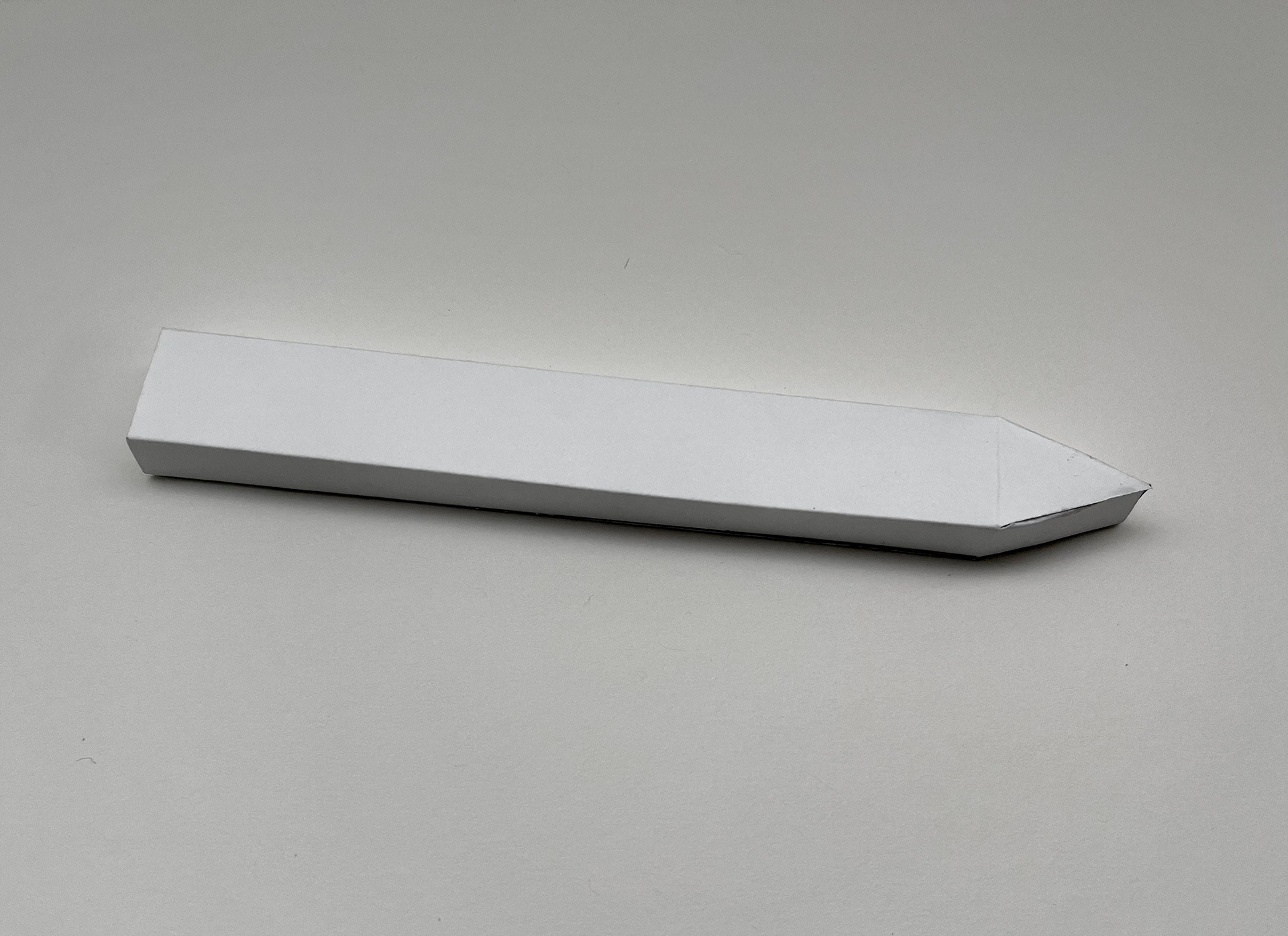
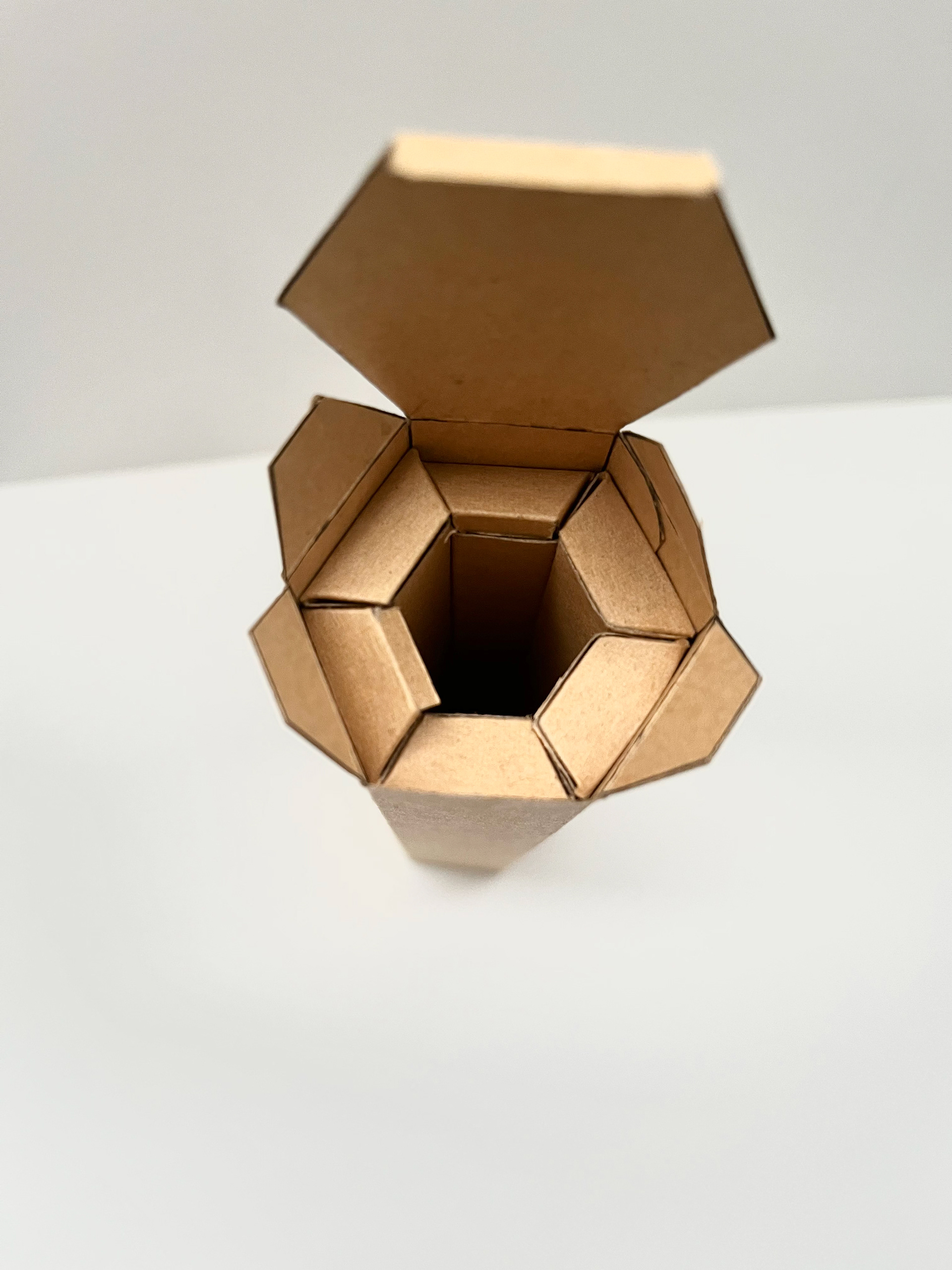
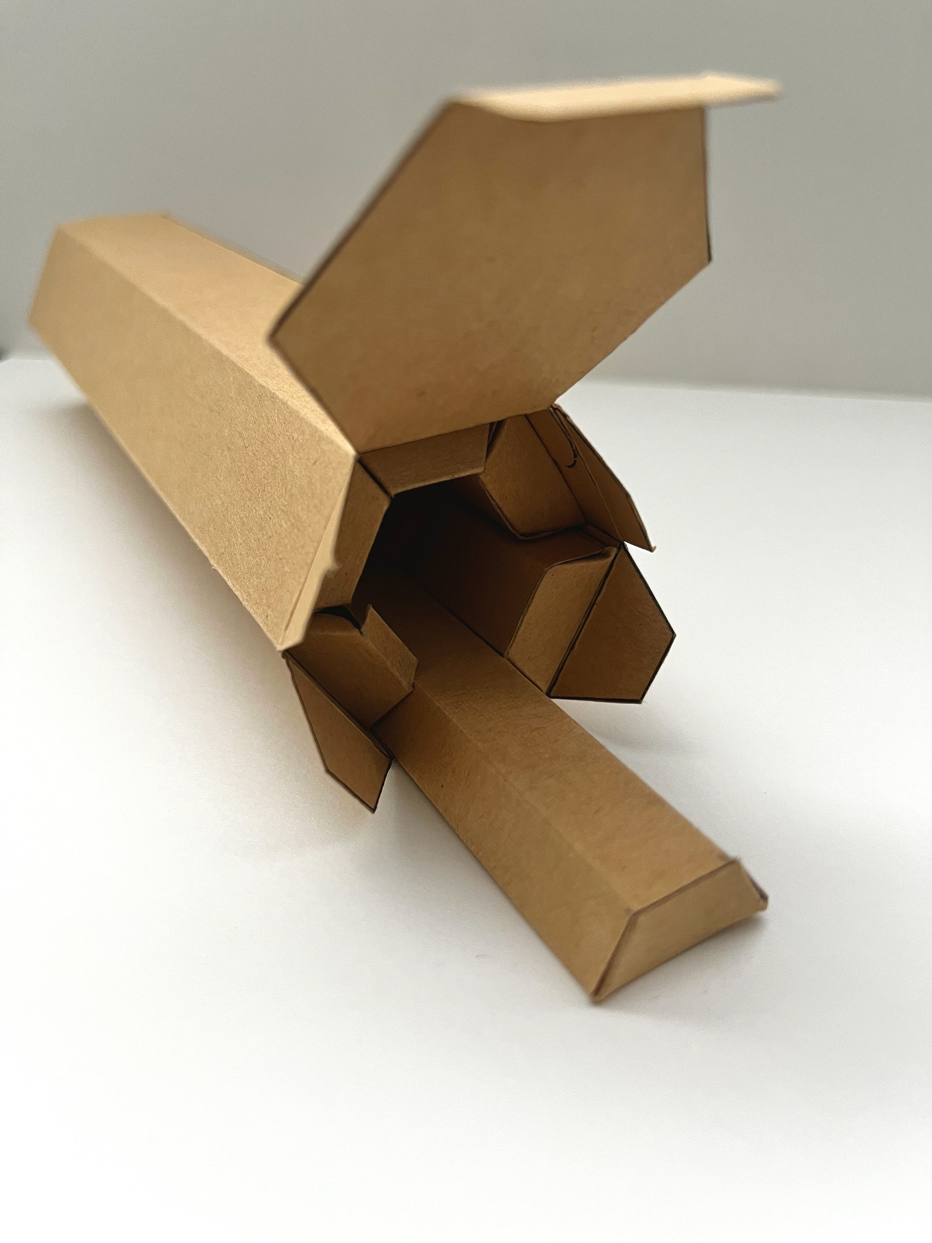
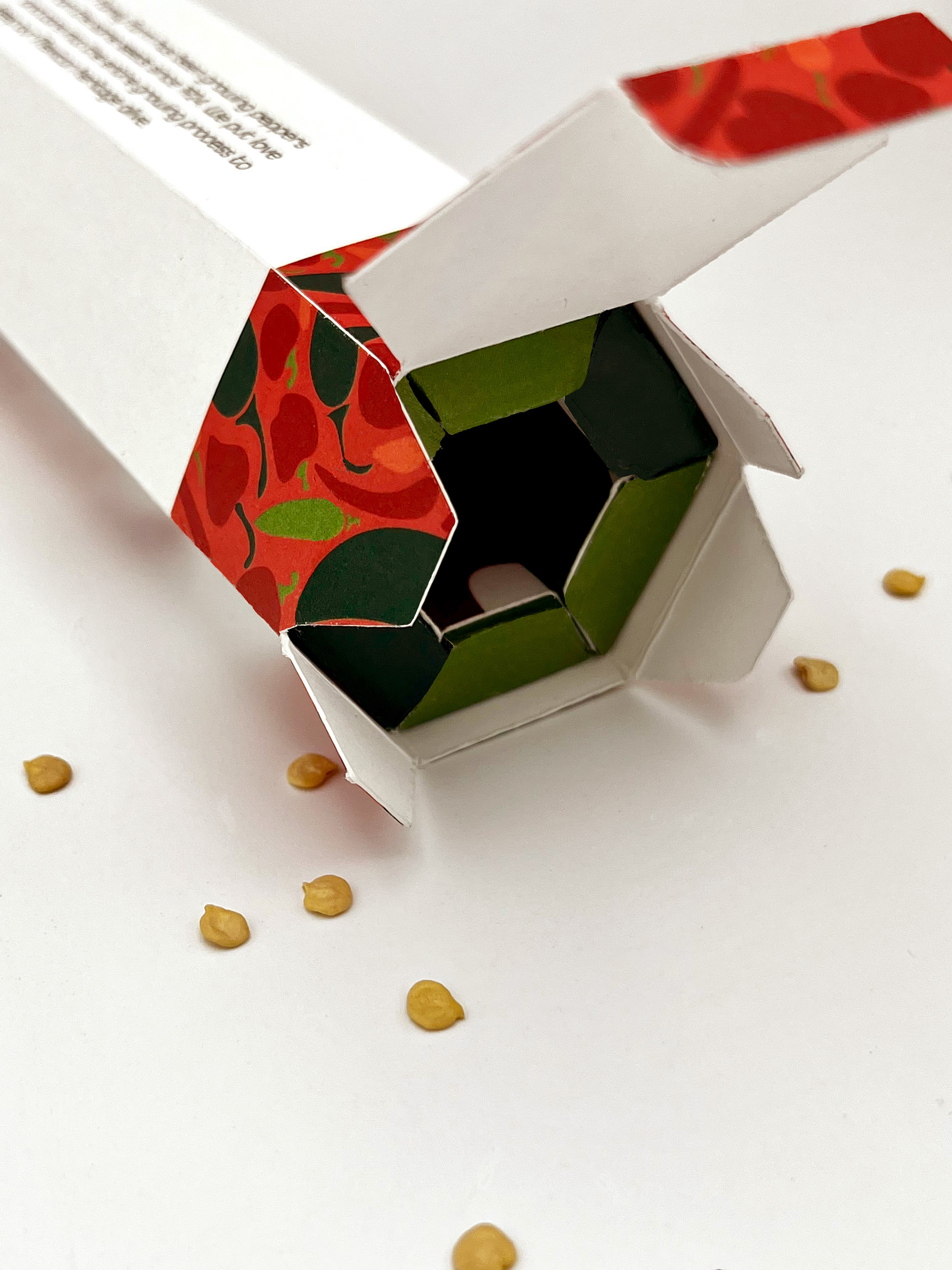
I designed and prototyped dielines that could fit my design goals. To fit the primary idea of little wasted packaging, I altered the shape of the primary seed packages so they angled inward and slid into a hexagonal package,
Style Sketches
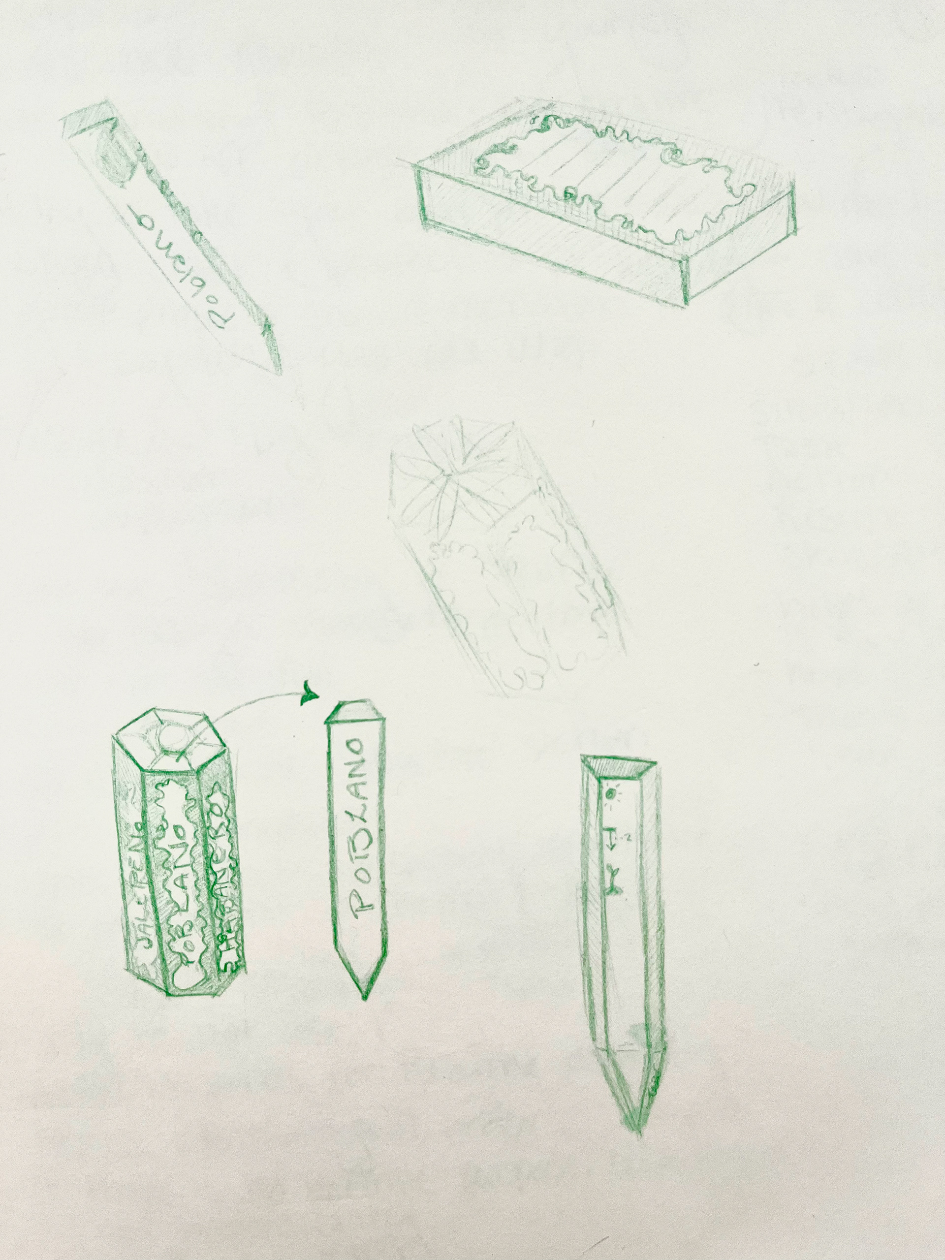
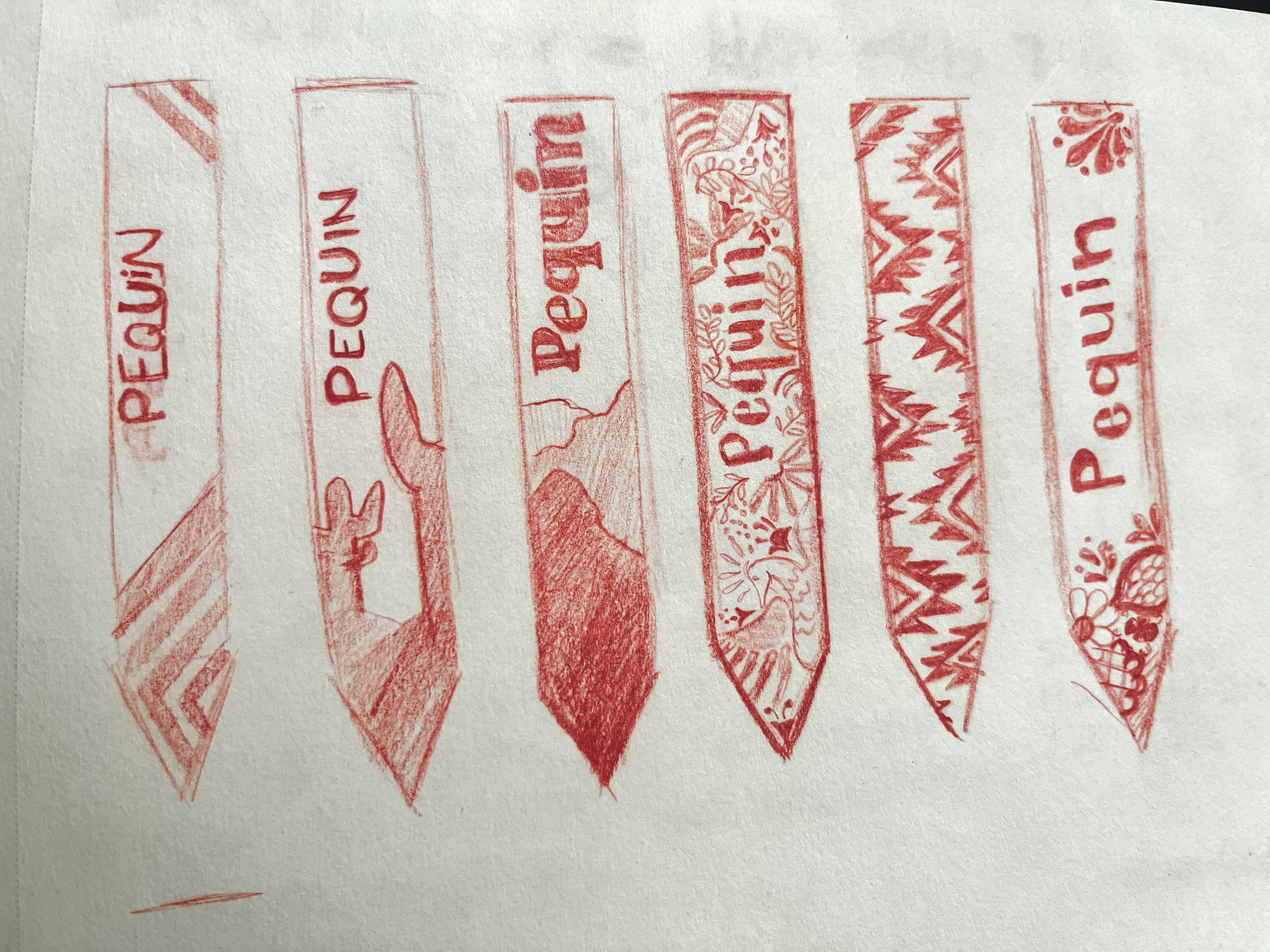
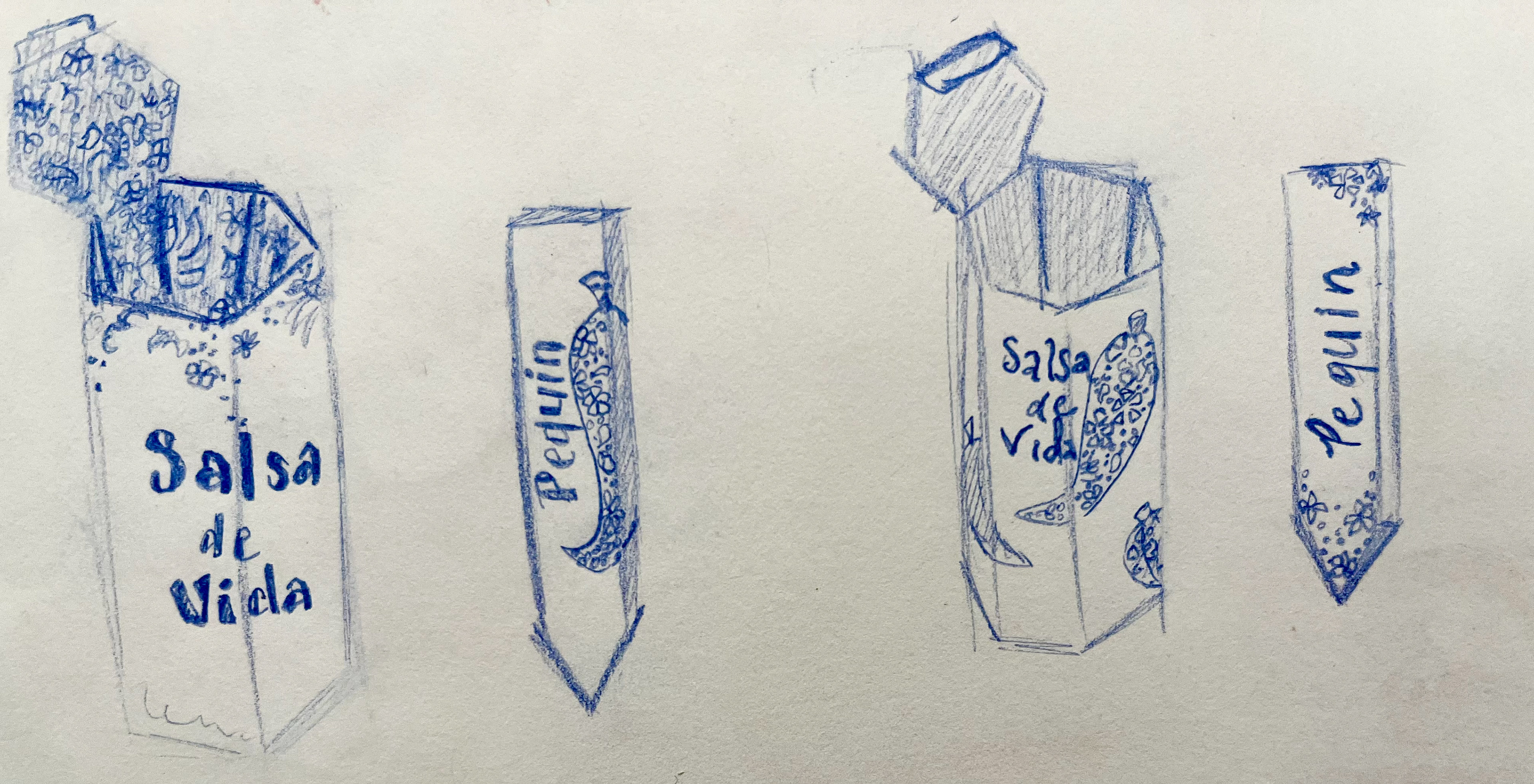
The design aesthetic is inspired by Mexican embroidery and pottery patterns. The branding aims to honor Mexican patterns and colors but also introduces an illustrative component to show the flavor and power that their product can have. The various peppers offered in this package are displayed throughout the pattern, giving the consumer a better understanding of the contents of the box.
Explorations
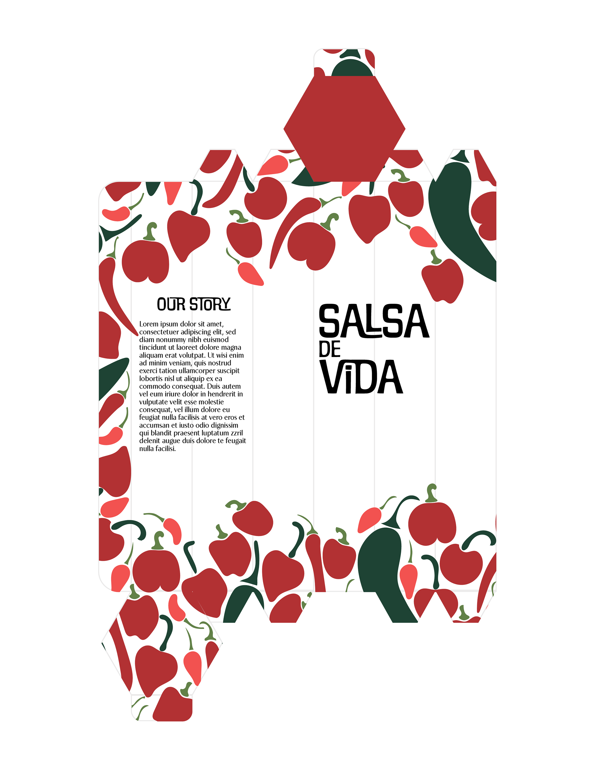
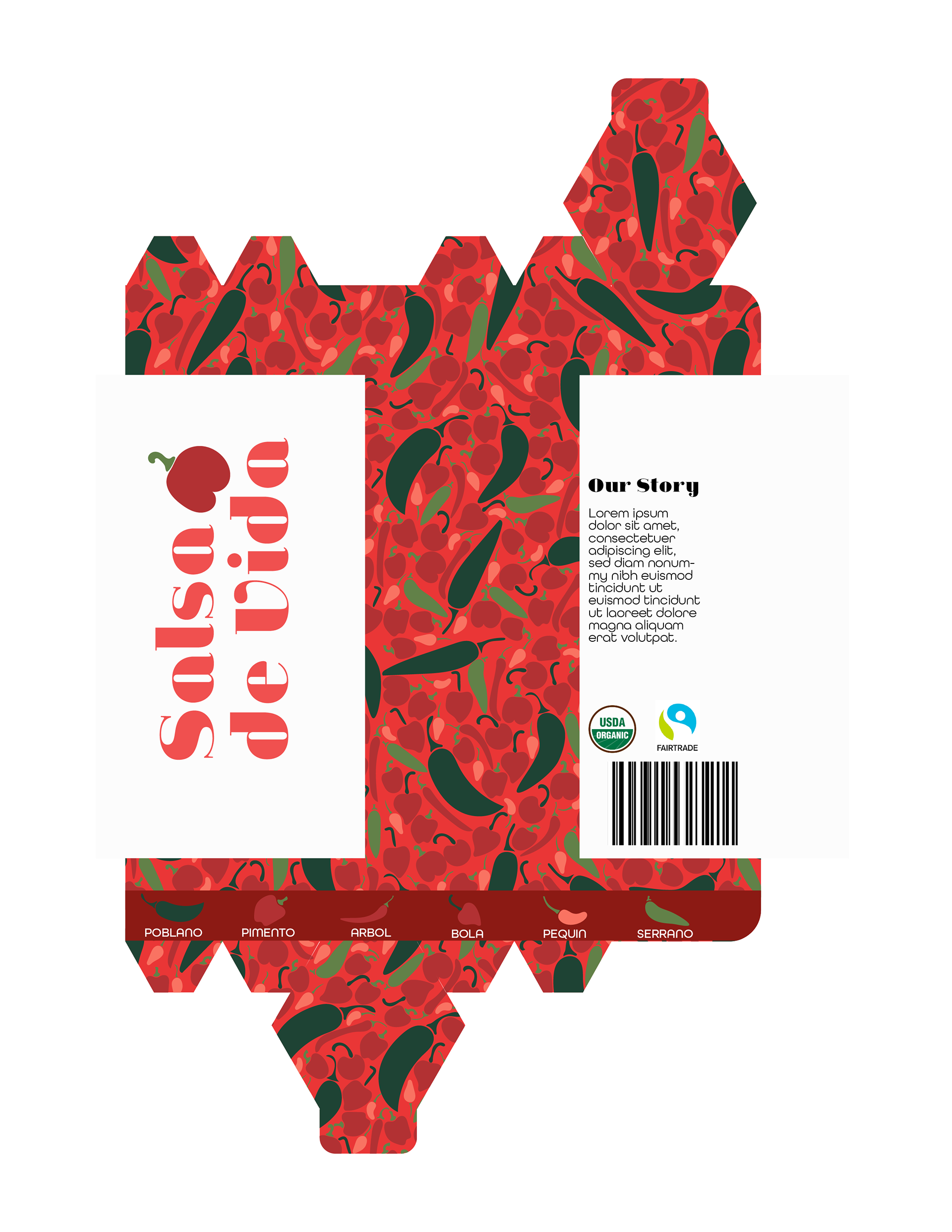
Initially, I created a box more heavily influenced by the traditions of Mexican embroidered clothes, with the patterns focused on the edges of the package. After testing it out, however, it did not have the intended effect of vivacity and strong initial impact. With this in mind, I tightened the pattern, created a stronger color overall, and reworked the logo to fit with the new design.
Systems
Jeanne Moderno Bold
A B C D E F G H I J K L M N O P Q R S T U V W X Y Z
abcdefghijklmnopqrstuvwxyz
A B C D E F G H I J K L M N O P Q R S T U V W X Y Z
abcdefghijklmnopqrstuvwxyz
Iconography
These illustrative icons were used throughout the pattern and along the bottom banner. They were used to identify the variations of pepper seeds that come in the package. To make the pattern, the icons were fit together by hand to create a unique varied, and well-fitted look.
Final Logotype
The final logotype was strong, bold, and full of movement. The jauntily placed pepper plays into the overall theme and attitude of the brand. "Spice of Life" is the main driving outlook of this branding.
Final Flat Files
Final Application
