For this project, I was paired with a partner and we were tasked to go through the process of making an app. We had to do the UX research, flows, and testing as well as design the UI interface, usability, and aesthetics. We chose to create an app that allowed the user to buy and sell thrifted clothes online.
Effortlessly Shop Sustainability
Second-hand shopping is made easy and transparent with Terre's shopping experience. Green Sellers are marked clearly so you can easily support those who do practice the most environmentally friendly selling habits.
Research Interviews
We began our process by interviewing online shoppers from a variety of demographics. From these interviews, we were able to steer our app development to be as current, useful, and successful as possible. From there, we determined pain points, researched our main competitors, and decided on how our app could solve current problems and create a better user experience.
Some common pain points we wanted to address in our app development were:
• Many of our users were overwhelmed with their feeds on current shopping apps.
• 75% of users felt that the shopping interfaces they use most often felt outdated.
• Users wanted a curated feed that suggested both products and brands/sellers that fit their shopping habits.
Personas
From our research and interview results, we made four key personas with varying backgrounds and some overlapping needs. While some cared more for affordability and ease of use, others held sustainability and seller transparency higher on their priorities. Additionally, some users wanted an extremely paired back user interface, with the bare minimum branding, while others wanted to have a more specialized experience. With these notes in hand, we began creating an app to fit all of these needs.
Competitive Analysis Interview
Before launching into our own app design, we researched the highest competitor brands. We decided the popular brand Depop would be in the highest competition for our same demographics and brand goals. We researched their brand guidelines, aesthetics, and core principles.
Competitor User Flow
In order to better understand and grasp the user experience of our main competitor, we created a flow map of key tasks and processes, including the signing up process, the buying process, and how a user can favorite and save products. This flow study allowed us to visualize the weaknesses and strengths of interconnectivity within the app.
Value Proposition
To address the current frustrations of existing shopping app users, we will create a home page with a simple, straightforward interface, so as not to overwhelm the user. This home page will also feature custom recommendations based on the activity of each particular user. Because this is a thrift shopping app where anyone can sell items, we will also offer personalization options for user shops, such as the ability to add a cover photo. Users of other thrift shopping apps, such as Depop, also noted a lack of transparency in item price and shipping costs. Because finding bargains is so important in thrift shopping, our app will address this issue by making these costs more readily accessible, presenting them while exploring the feed.
When designing our app, we would like to target those of the Gen-Z population. Not only does this generation tend to value low-cost, unique fashion, they are also major proponents of climate activism. Therefore, our value proposition is to create a thrift shopping app dedicated to eco-consciousness and sustainability. Our app will feature carbon footprint tracking, biodegradable packaging, and incentives for eco-friendly behaviors. In addition, a portion of the profits will benefit environmental organizations.
Our App User Flow
We wanted to create a similar ease of functionality to our competitors, but with a cleaner flow. A common comment our focus group had on similar apps was that the interface often felt busy. To resolve this issue in our app, we wanted to have four main simple flows that stemmed from the home page. An additional flow we added not seen in other competitors was the "browse green sellers" feature. Similar to an explore page, this flow will provide users with a page to browse products similar to what they have been interested in, but with the added bonus of being sold by our verified "green sellers." These specifically verified sellers take extra steps to protect and preserve the environment, such as using sustainable shipping practices or selling green brands. Through this feature, users will have seamless access to environmentally friendly products with very little effort on their end.
Lo-Fi Wire Frame
Prototype User Testing
Now that the skeleton of the app was in place, we went back to the same user testers we had in the first step. In order to not overwhelm the user, we gave them three main flows to complete and explore within the prototype app. These three flows were:
1. Login/sign up for the app.
2. Add/remove an item from your cart.
3. Explore the "Green Sellers" page.
The testing results from these three flows would allow my team to pinpoint pain points across the entire app and address these issues accordingly. Additionally, after we asked the users to complete these flows, we conducted short interviews with each of them.
Interview Questions
1. When you log in, what is the first thing you do? Are there multiple ways to achieve this action?
2. What, if anything, is stopping users from completing each flow?
3. Which of the app’s features do you feel is most valuable to you as a user/which
4. What would you use the most? The least?
5. If you could change one thing about the flow, what would it be?
6. Is the navigation/layout intuitive, or did you find yourself getting lost?
7. Did you feel the check-out experience was intuitive and easy to use?
8. After you finished checking out, did it make sense to you to go back to your cart?
9. Would you use the “Green Sellers” page in your own shopping? If so, why, if not, what would make it more usable/helpful?
10. Which feature excites you the most?
Lo-Fi Interviews
Results
1. Better Defining the Green Sellers Section
2. Ensuring Affordability
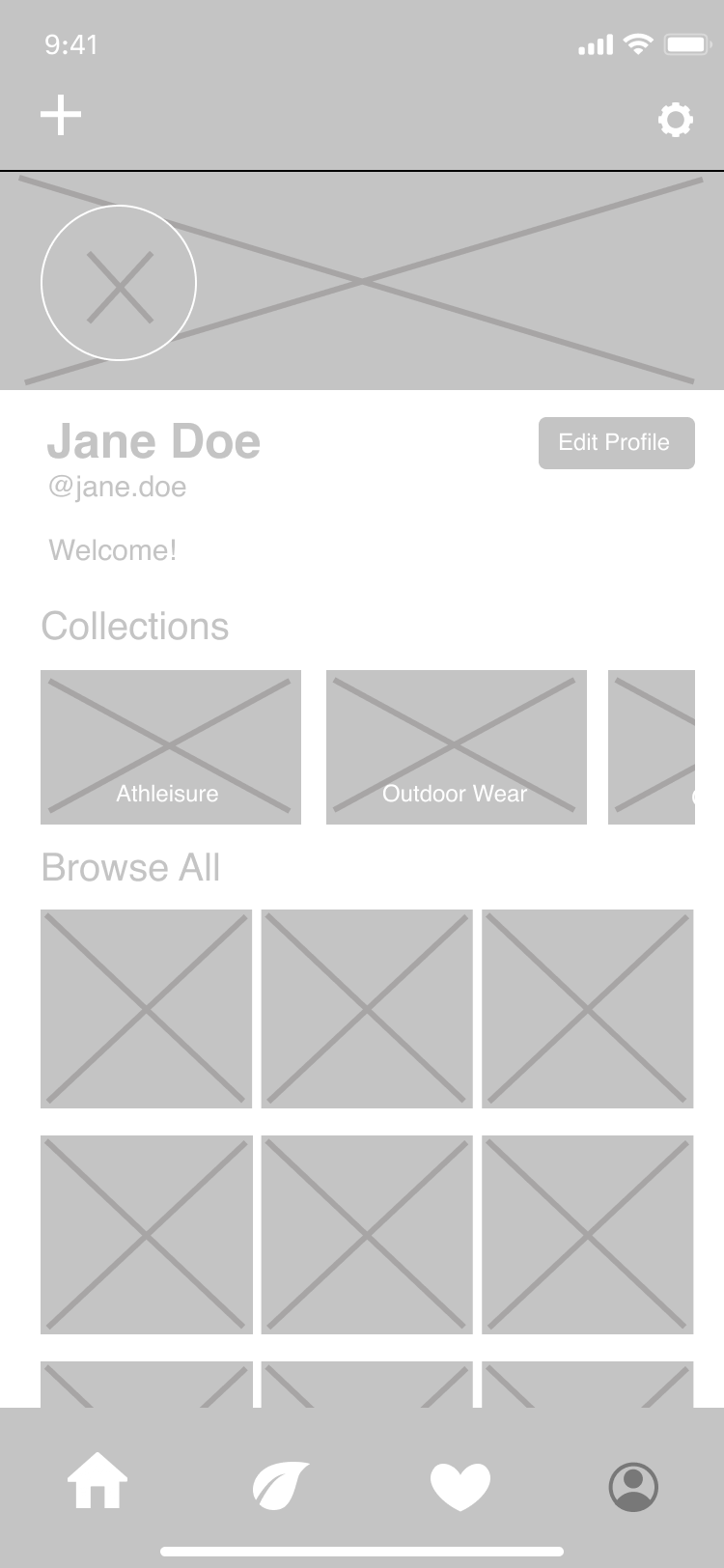
3. Organizing Profile Pages

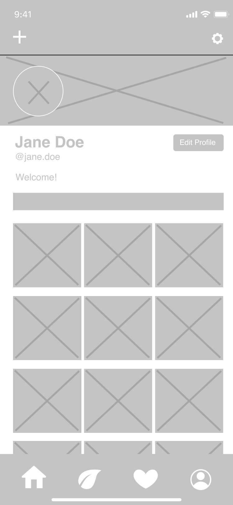
Initial Lofi Prototype

Lofi Prototype After User Feedback

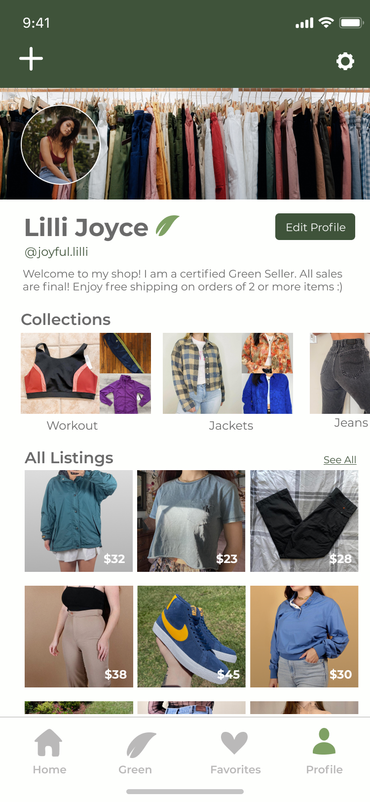
Hifi Prototype
Moodboard
Systems
To balance a clean aesthetic with a strong branded feel, we kept the colors very restrictive but gave the logo and icons a very distinct organic illustrative style. Additionally, the geometric typeface helped bring and maintain structure. Lastly, we decided to have slightly rounded corners on all buttons and UI components to keep it looking clean, but not harsh.
Hi-Fi Interviews
Results
1. Viewing Order Details
2. Internal Messaging
3. Direct Message Sellers
Hi-Fi Frames
Prototype

