Sites of San Diego is a mobile app guide featuring nuanced typography, unique branding, and intuitive functionality. UX/UI design was a major point of this project and had to be considered at every step of the process. The solution I came up with was to create a usable map and guide to trails of natural geographic features in San Diego county. The organic shapes and simple color themes of the icons and elements of the app catered to an audience of a broad age range with the common interest of exploring the natural beauty of San Diego.
Personas
Style Explorations
Systems
The colors I chose to use for this project were natural, somewhat muted variations of the vibrancy seen at the chosen locations. The fonts I selected specifically with my personas in mind. I wanted the body text to be simple yet not boring. I wanted to draw in younger audiences with quirky and new type treatments but kept it paired back enough so as not to exclude more mature users. The sharp, features and universal look of the unchanging width of the letters of Regulator Nova allowed for this balance of old and new. Because this app is all about trails and sites, I wanted the complementary type choice to reflect what one might see on a trailhead or signpost. While condensed, the less rigid structure of the build of the letters gave a good contrast to the strict geometry of Regulator Nova.
Cheap Pine
abcdefghijklmnopqrstuvwxyz 1234567890 !#$&)
Regulator Nova
A B C D E F G H I J K L M N O P Q R S T U V W X Y Z
abcdefghijklmnopqrstuvwxyz 1234567890 !#$&)
Icons
I wanted my icons for this app to have a clean, organic look. I felt this would best suit the needs and appeal to the various personas by keeping things simple, yet bringing a unique, illustrative look to enhance the natural elements of the featured trails. By making them both modern and approachable, it would encourage interaction with all ages, thus encompassing my target audience.
Mapping Wireframe
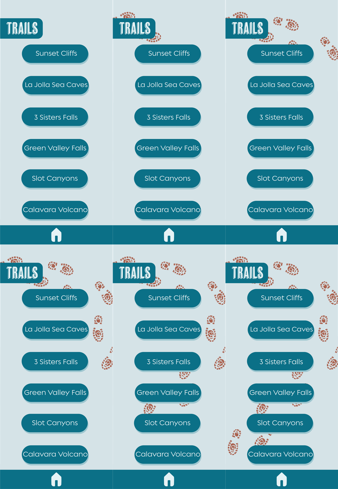
When mapping out the schematics of the wireframe for this app, I wanted to keep in mind the usability and the needs of my target audience as well as the original intended use for this app. As it is designed as a tool for the user to use both before and during their hike, I wanted every page to easily flow into other subsections of the app and made the pages interconnected. However, to maintain clarity and prevent the user from getting too buried within the pages of the app, I also designed a universal navigation bar at the bottom of every page.
User Interactivity
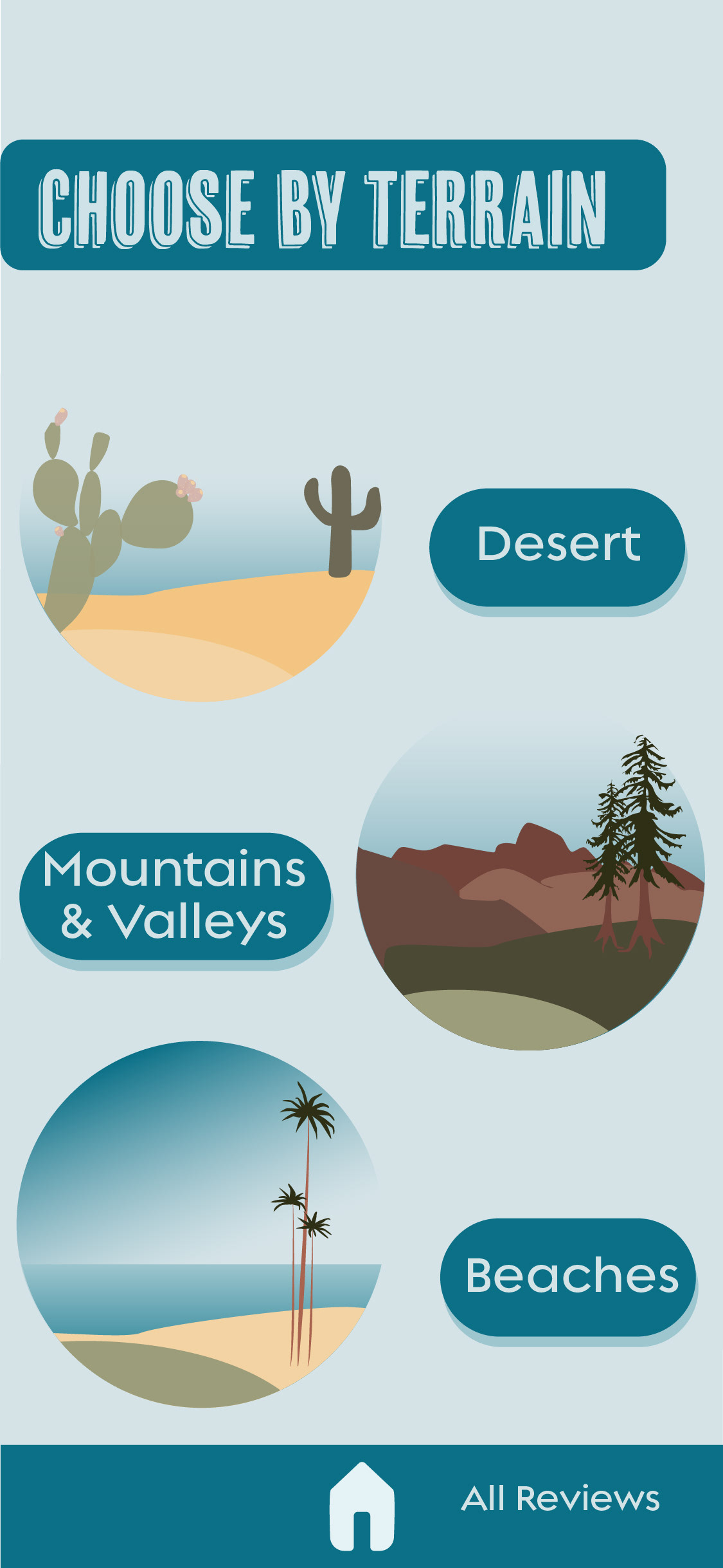
As I continued to develop the pages and navigation, I wanted to ensure the smoothest, most intuitive user experience possible. To do this I implemented simple indications, such as having a double layer on buttons to encourage interactivity. Additionally, I maintained clear mastheads and navigation bars so the user was aware of what page they were on and what at what kind of information they were looking for. Another example of encouraging user interactivity is through the alternating rotation of landing pages, each featuring one of the three main terrains of San Diego: of desert, ocean, and mountain scenes.


Final Application

