"Finding the perfect property shouldn't be hard."
Consider the days of stressful house hunting over with the Perfect Properties app. The clean, quick, and smart design of this app works with you to find your dream home with ease.
Objective
A responsive web app that provides property buyers with information on properties of interest.
Real estate investment is a growing trend among individuals seeking to achieve financial security. It is an exciting and emotional experience, but often complicated. While there are plenty of blogs and agencies providing information, often, buyers new to the market may struggle to get started without professional guidance and waste time viewing properties out of their range. This web app will provide them with the expertise needed to get started efficiently.
Challenge: Create a user-friendly, responsive web app that provides small-scale property buyers with information on properties of interest. App users should be able to log in to their account and search a database of relevant content as well as save properties they are interested in.
Purpose: Career Foundry case study for UI specialization cours
Timeline: 1 month
Role: UX/UI designer
Tools: Figma
User Flow
Design requirements for this app included:
Sign in, create user profile, and input property criteria.
Search and filter available properties.
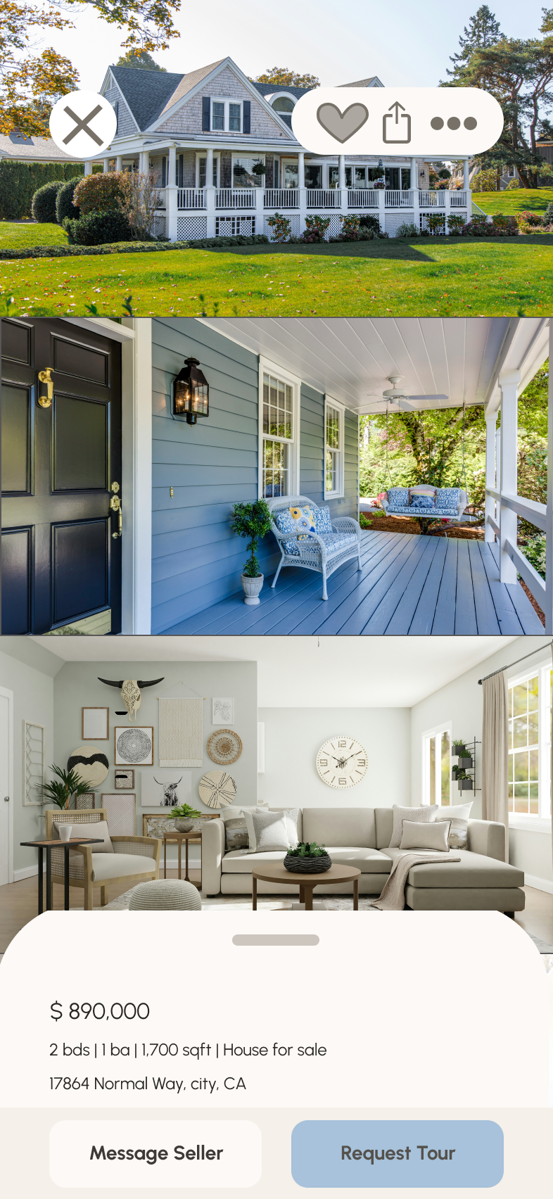
Access comprehensive information about a given property (e.g., specs, value, previous sales, location, 360° visuals, etc.) and its neighborhood.
Bookmark a property listing.
Property recommendations feature.
Ability to contact real estate professional when wanting to move forward with a property (i.e., guided viewing, ready to invest.)
To account for each of these requirements, a user flow with distinct tasks marked out was created to ensure each deliverable was met.
Persona
Low Fidelity Wireframe
I began my wireframing process by creating paper sketches of each screen needed to complete the given tasks. This allowed me to efficiently build the foundation of the app without going into too much detail.
Mid Fidelity Wireframe
From my paper wireframe, I created a digital version and cleaned it up for better usability. At this stage, I also began creating an asset library to make designs universal and easily altered in future versions.
Moodboard Exploration
Before moving forward to high-fidelity wireframes, I needed to establish a distinct brand identity based on the keywords given in the project brief: "clean, quick, and smart." The design also needed to include either green or blue, so I created a moodboard based on each color.
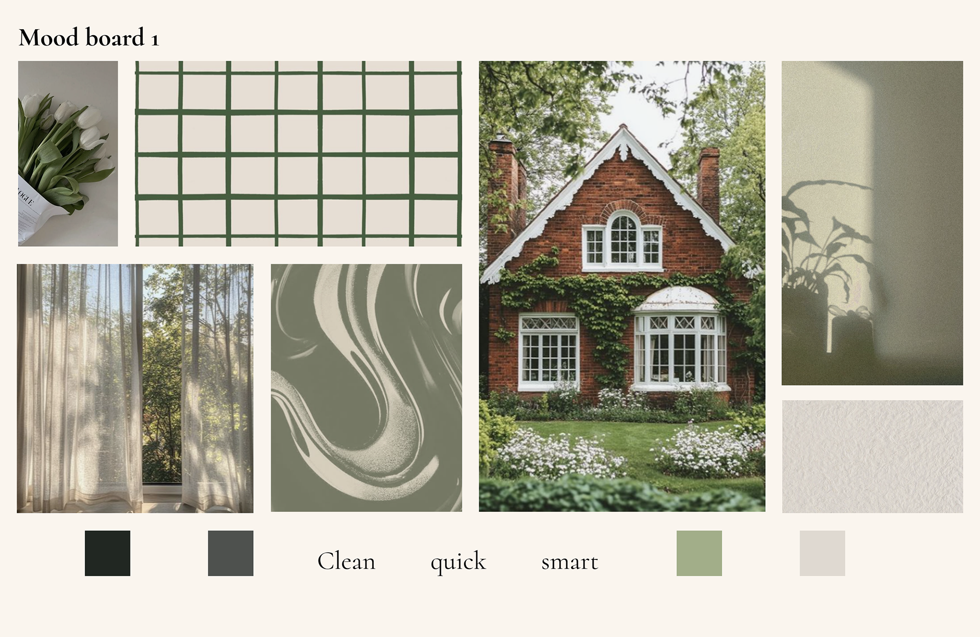
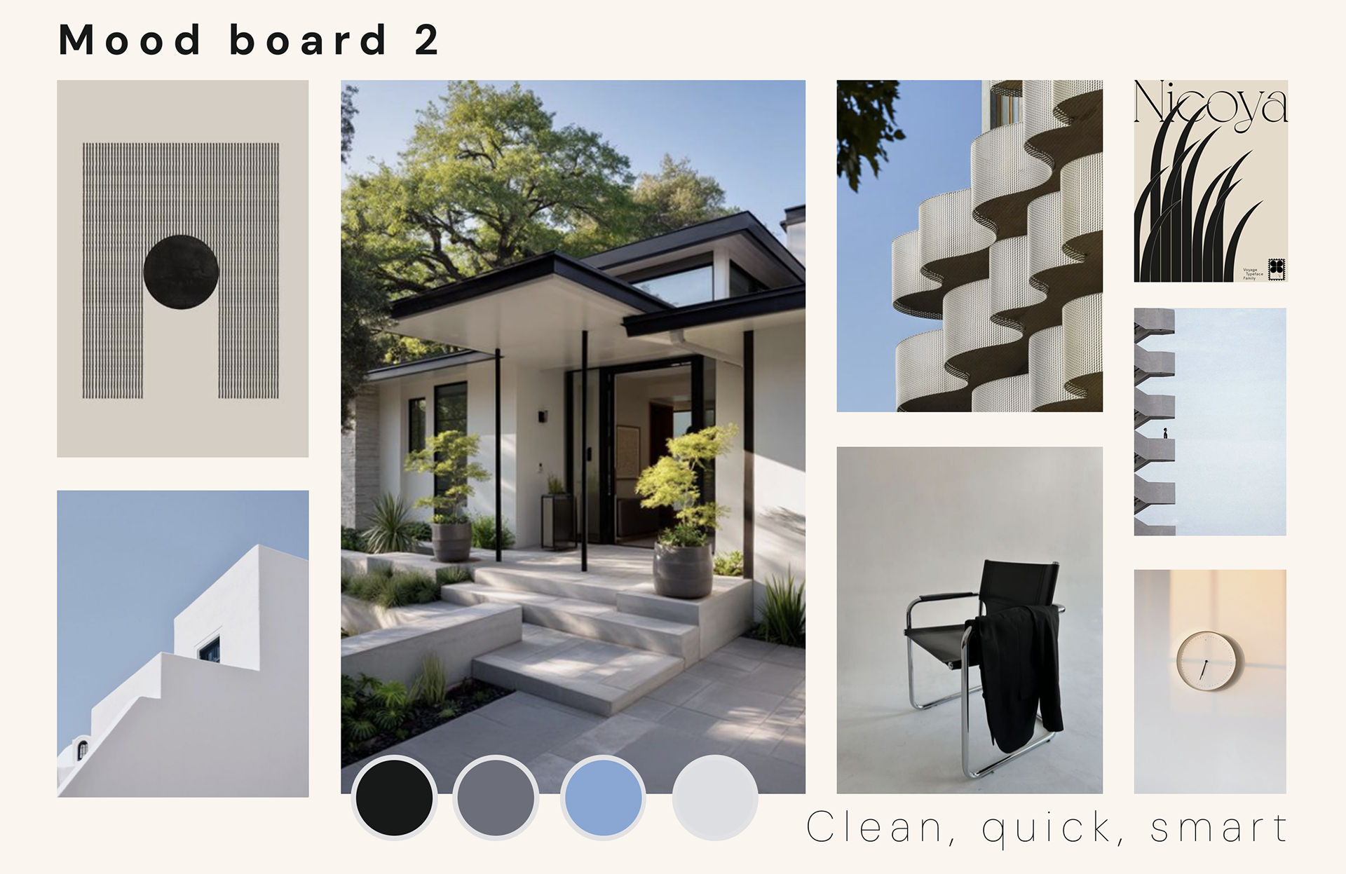
I chose to follow the visual direction of the second mood board. While each mood board provided a unique and distinct visual identity, the second option more clearly follows the branding guidelines of “clean, quick, and smart.”
The brutalist, structured, and organized elements within the images portray clean, thought-out lines that easily translate into an online interface and digital brand identity. Simple, geometric shapes emphasize the straight forward nature of a quick user experience. Lastly, the crisp colors and sharp structures evoke a smartness to the design, tying in the whole mood together for the most seamless house buying process for users.
The brutalist, structured, and organized elements within the images portray clean, thought-out lines that easily translate into an online interface and digital brand identity. Simple, geometric shapes emphasize the straight forward nature of a quick user experience. Lastly, the crisp colors and sharp structures evoke a smartness to the design, tying in the whole mood together for the most seamless house buying process for users.
Creating a Logo

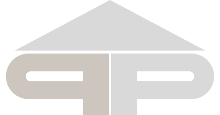
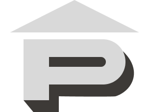
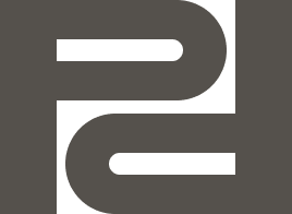
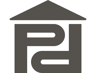
I based the logomark on Syne: the primary typeface for branding. I wanted to maintain a clean, more brutalist design to adhere to the moodboard. The logo also needed to be scalable and still read as a real estate logo. Here, the visual representation of my process and the different iterations of the logo can be seen, with the final version merging the others in a geometric yet illustrative logo.
Style Guide
Logo
Typography
Color
Icons
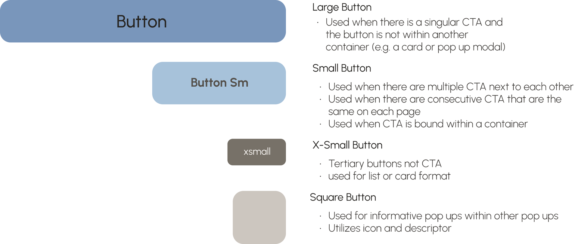
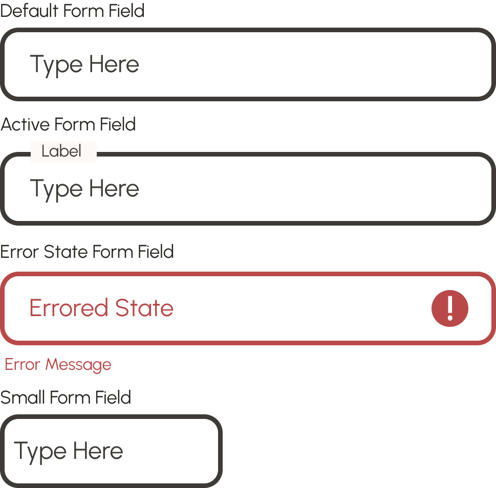
Assets: Buttons and Form Fields
High Fidelity Frames
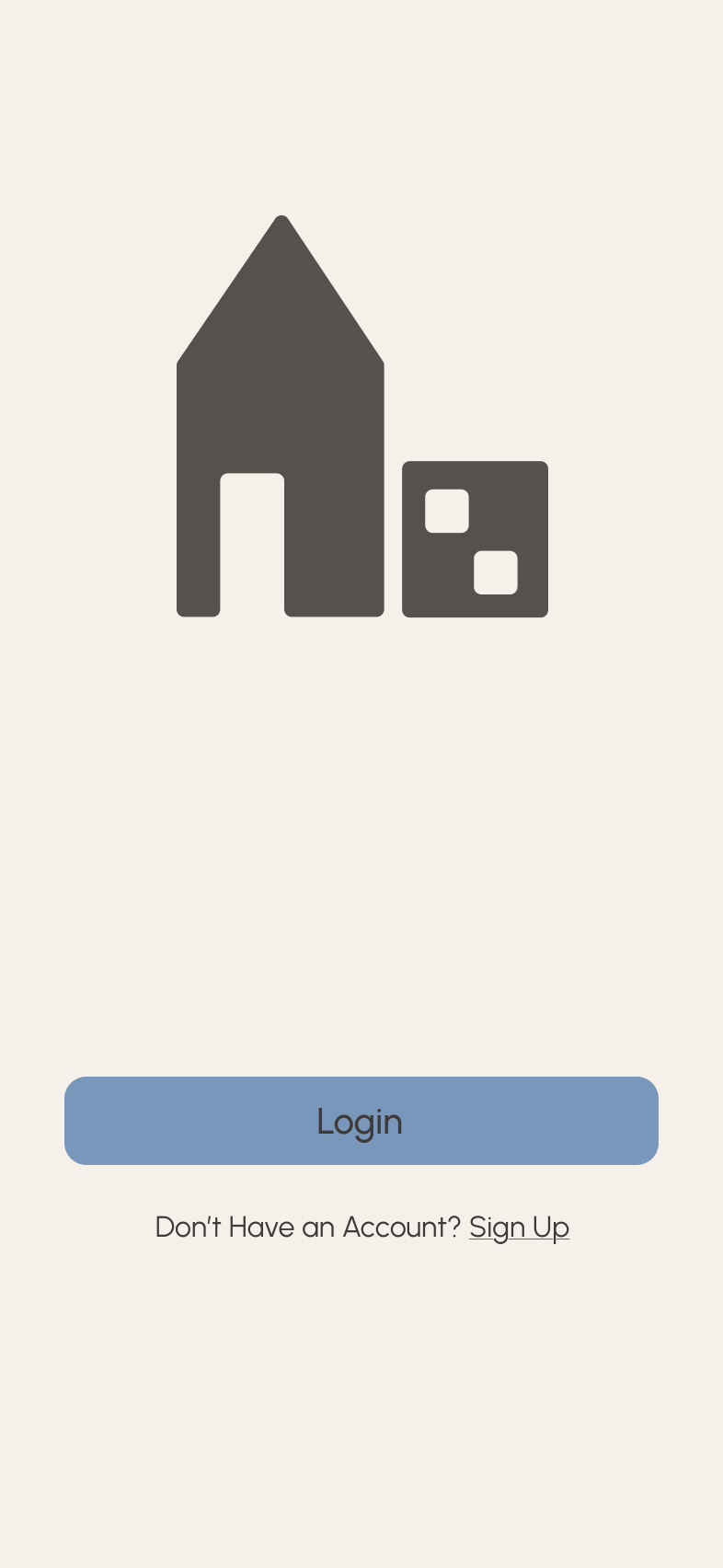
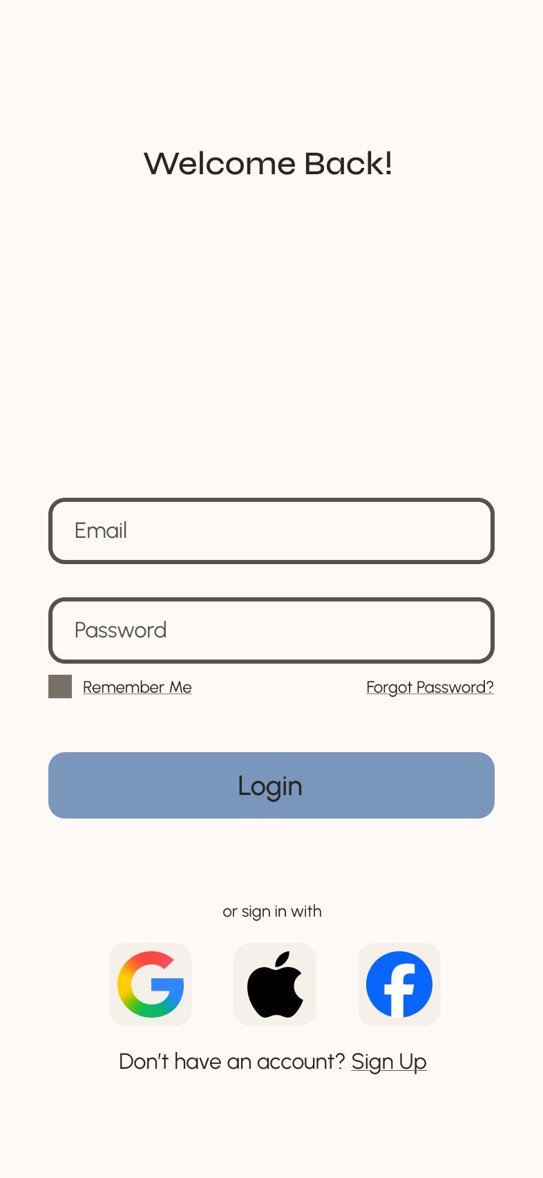
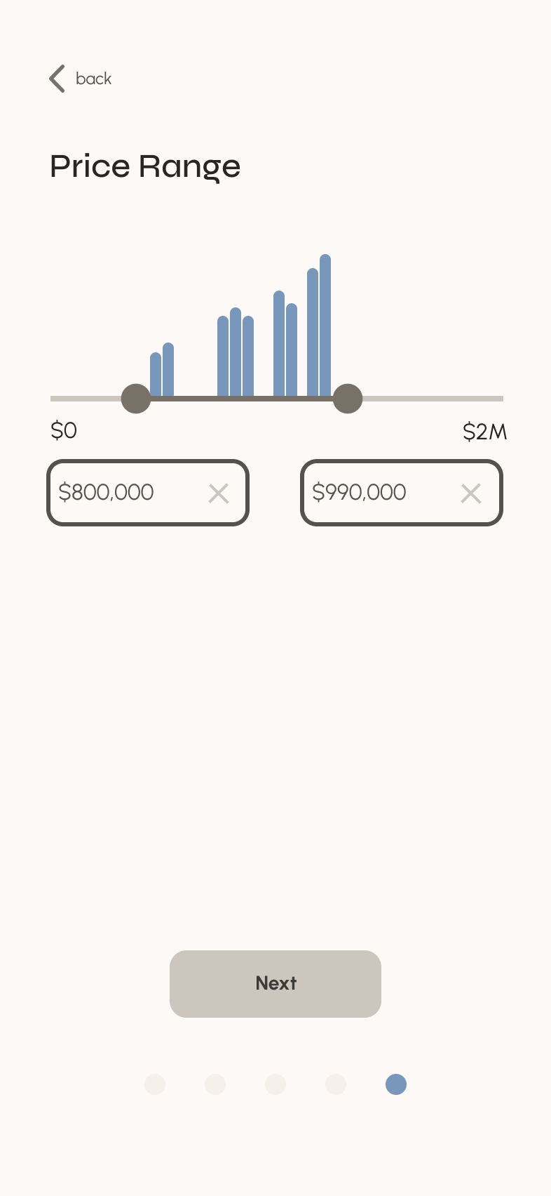
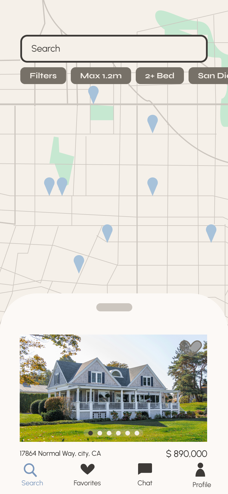
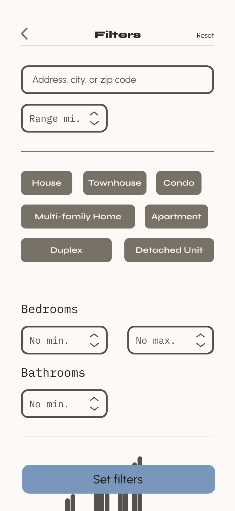
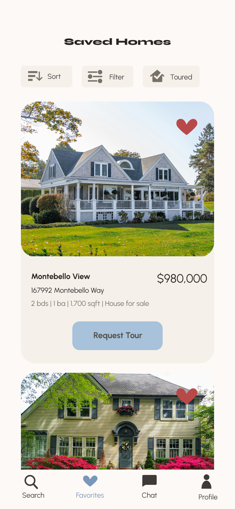
Utilizing the style guide established, I created a cohesive and clean UI that maintained a professional brand without losing its personality and originality. The muted colors and rounded edges convey a warmth that offsets the strict grid system, creating a sense of balance. Gestures and small animations were incorporated to give a natural, gentle feel to the app.

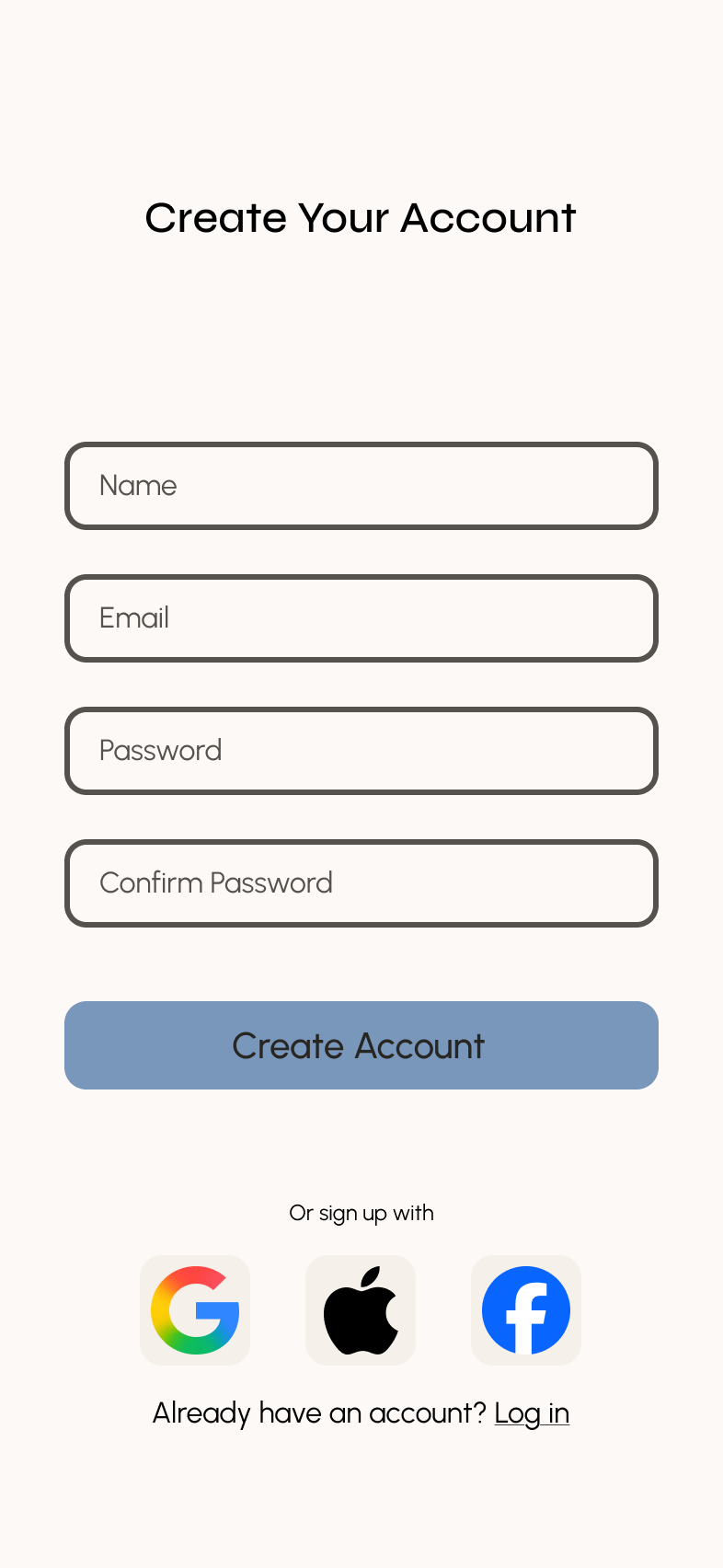
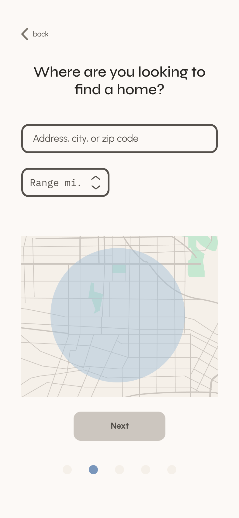
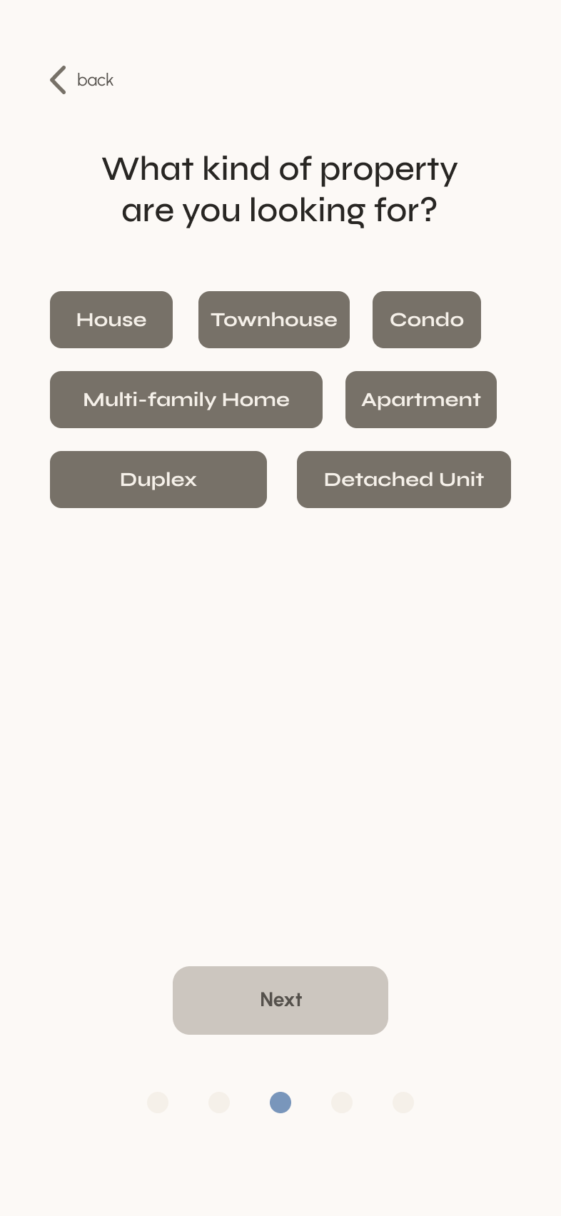
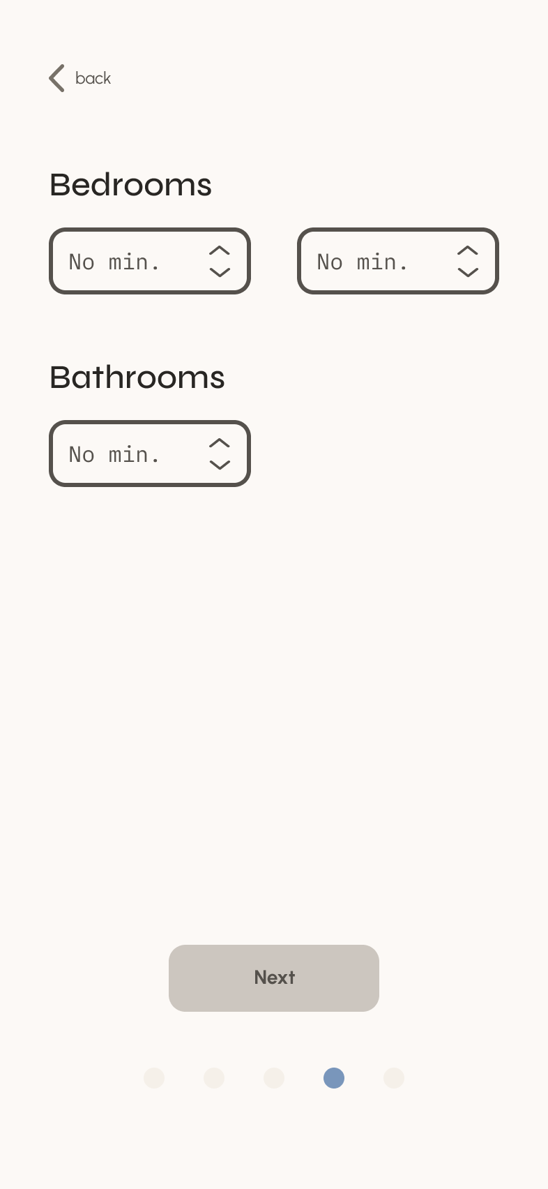

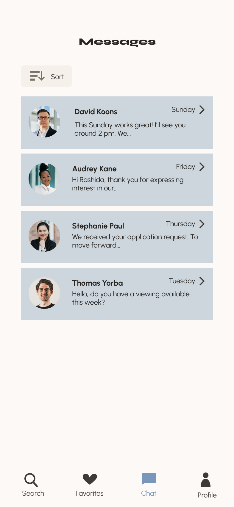
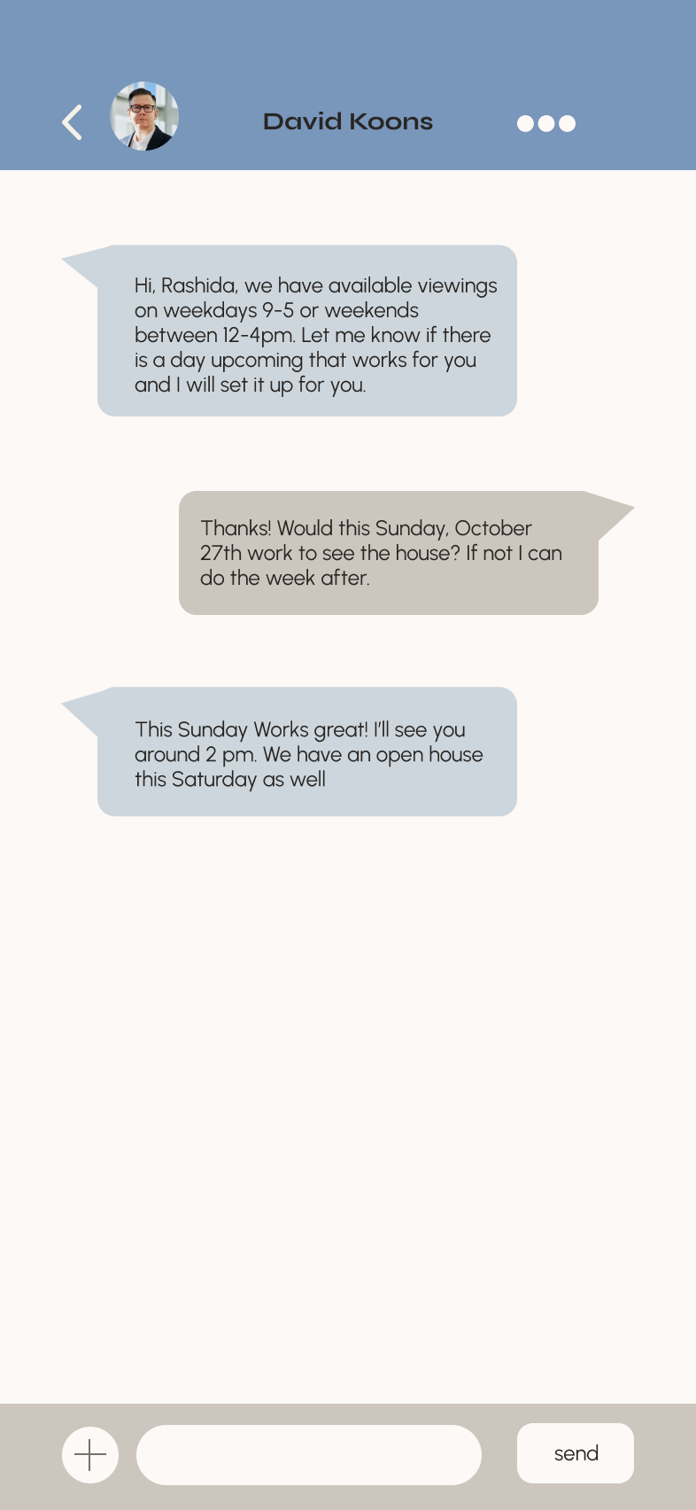
Screen Comparison: Through the Stages
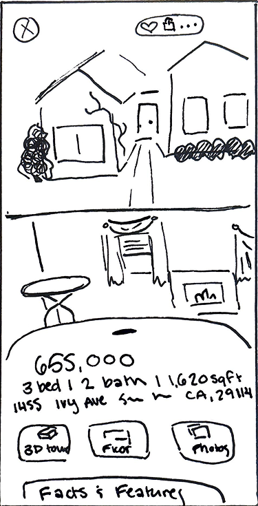
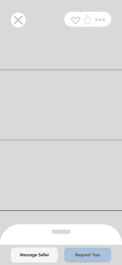
Final Design Implementation
Try Out the Prototype Yourself!
