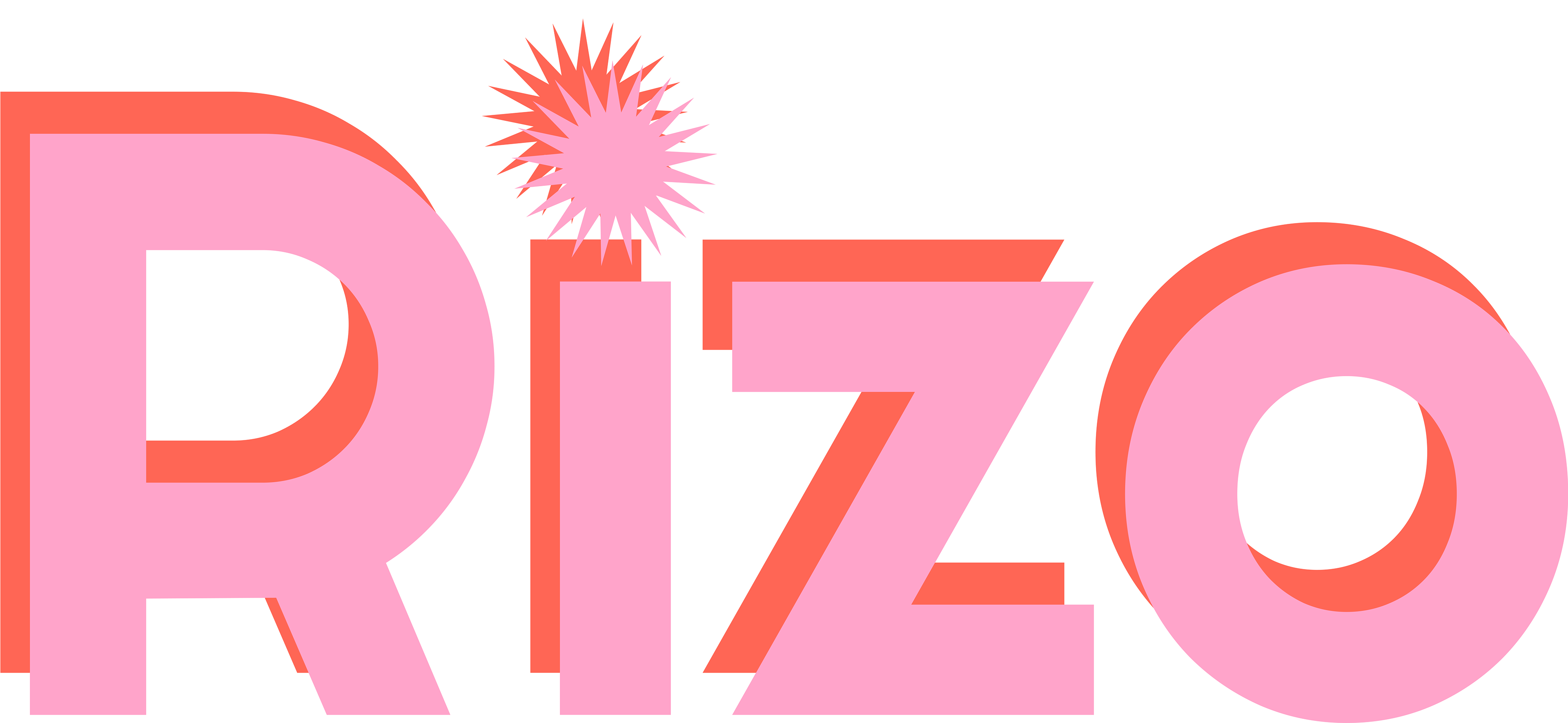
Rizo is a responsive health app designed specifically for people with period-related diseases and disorders in mind. Dedicated to giving back control to these users, Rizo helps users track their periods, customize and log their symptoms to fit their unique needs, and match with healthcare professionals who match their health concerns.
Challenge: Allow health-conscious individuals to log symptoms in a responsive health portal as well as access general physical and mental well-being features.
Timeline: 6 months
Tools: Figma, UX tweak, Lyssna
Design Process
I utilized a lean UX design process to ensure that I could maintain consistent feedback throughout the design process to back design decisions with data gathered through testing and surveys.
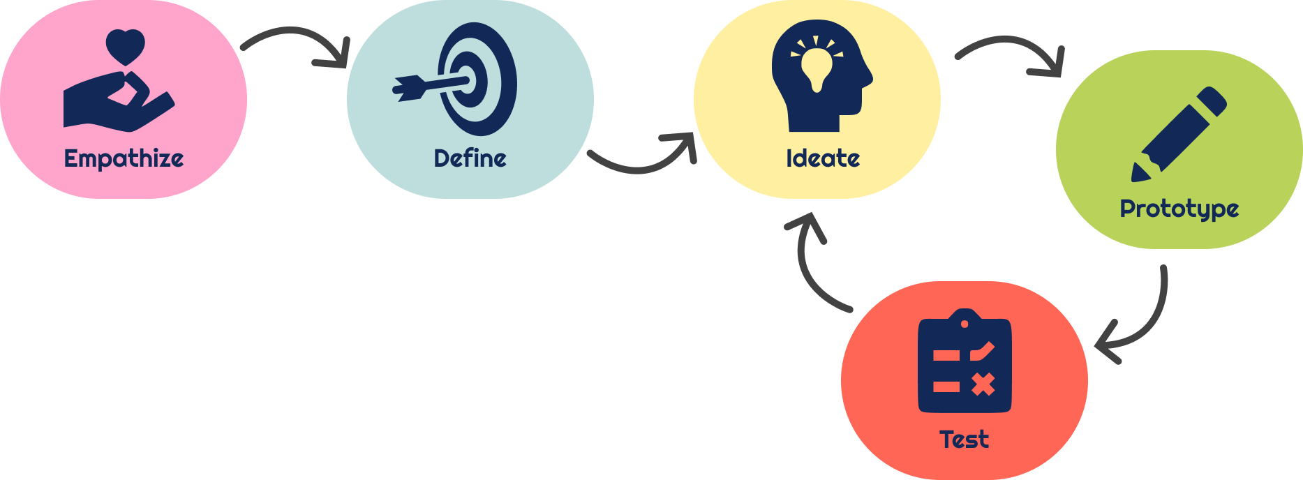

1. Empathize
Competitor Research
Clue Competitor Research
Overview
Clue prides itself on being a private, highly secure menstrual tracking app. It encourages its users to become experts on their own bodies through tracking and predicting symptoms and cycles.
Strategy
Clue claims itself as the #1 doctor-recommended free menstrual tracking app. It advertises that it is used by over 15 million people worldwide and is made by women and backed by researchers.
Market Advantage
Numbers alone give this app an edge over other apps, as many users trust apps that have a high number of people using them. Additionally, Clue caters to people throughout their menstrual life, from period to conceiving, to menopause, and it has functions that take conditions such as PCOS or endometriosis into account.
This app is also encrypted; even if it is just tracking the users' cycle, all of their data and information is kept secure.
This app is also encrypted; even if it is just tracking the users' cycle, all of their data and information is kept secure.
Lasa Competitor Research
Overview
Lasa is an all-in-one period tracker, endometriosis management, health education, and community board. It allows the user to track their period, medications, and symptoms. It encourages users to be participants in a study for endometriosis to aid in the knowledge and study of endometriosis.
Strategy
Lasa empowers users with health struggles such as endometriosis, PCOS, Fibroids, and more by providing a platform for education and community to chat with other real users with those diagnoses. Additionally, it makes interacting and charting fun by giving the user a garden to grow through interaction with the app.
Market Advantage
While Lasa is a smaller app, it does specify its audience more than most apps and provides a specific place for people suffering from chronic illnesses, setting them apart from other period tracking or health apps.

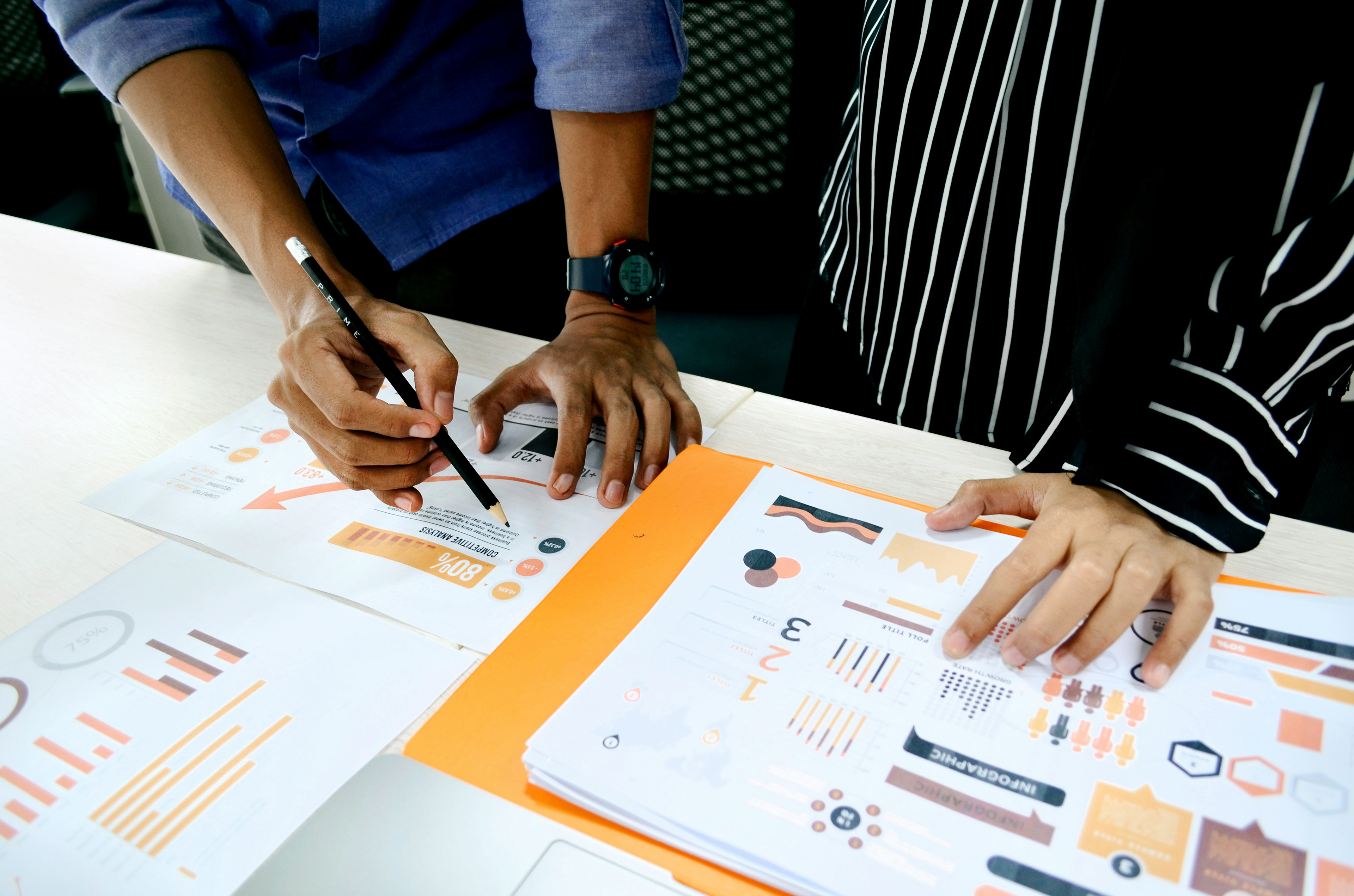
User Interviews
I conducted user interviews to gain insight as to what current menstrual app users think and feel about the apps they use, why they use them, or why they avoid them. Their feedback gave me invaluable feedback for current industry gaps and how I can fill them to users' satisfaction.
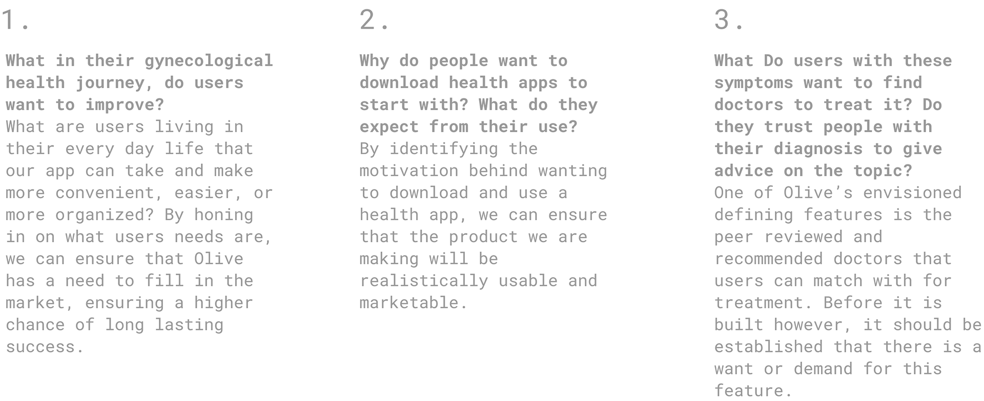
Research Goals
Interview Takeaways and User Pain Points
• Users want control over what they track to customize it to their needs (I.e., ordering/reorganizing the list of symptoms)
• Users will not pay high fees even if others them the features they want. This has driven away many users from using period tracking apps at all
• Keeping a lot of information simple is important for user retention, as it has caused users to abandon other apps
• Users do want to have some connection and community with either other users or with healthcare professionals
• Users do want to learn more about their bodies and what tracking certain symptoms can do for them
2. Define
Problem Statement
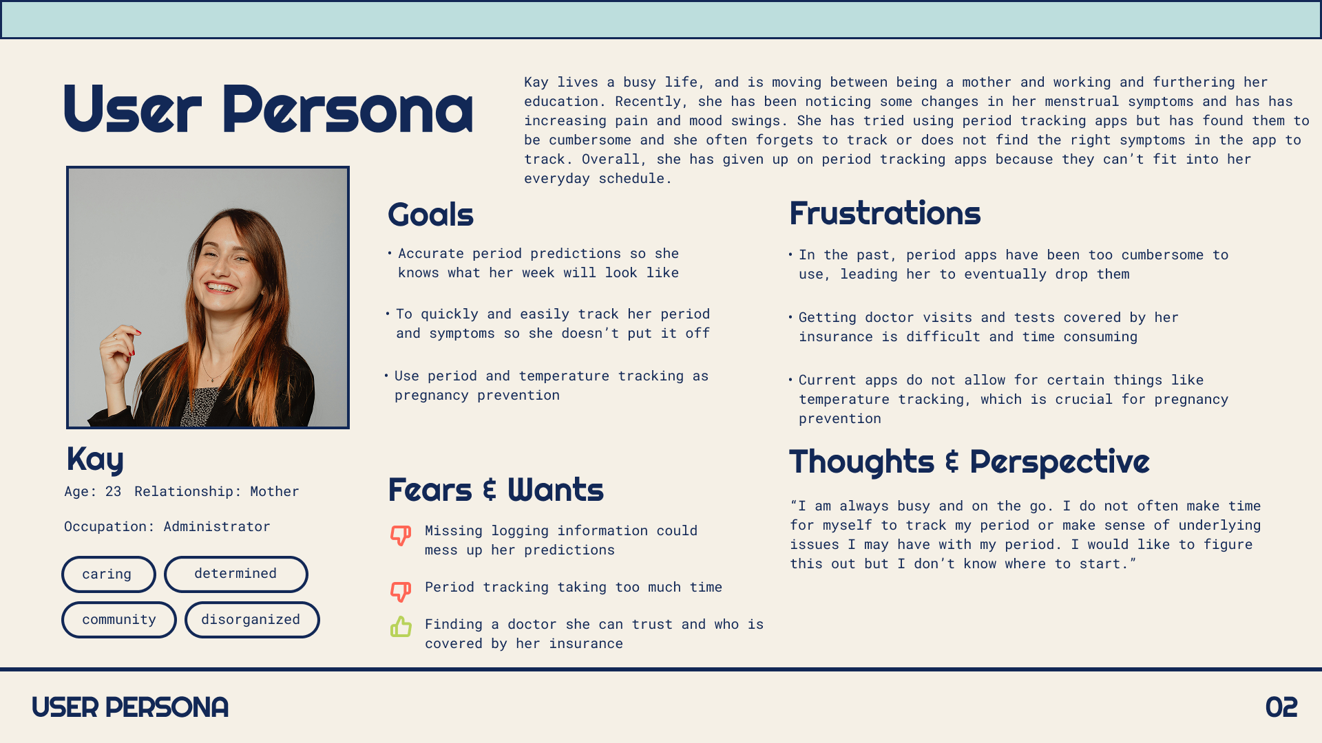
Sara needs a way to track her unpredictable periods and find trustworthy help for her gynecological health care because tracking her own symptoms has become scattered, and finding a gynecologist by herself is time-consuming and stressful. Sara wishes to have a succinct and reliable portal to work through her endometriosis problems without having to conduct extensive research to find the right doctor with good reviews.
We will know this to be true when she can better understand her symptoms through tracking cycles and symptoms and getting connected with a vetted physician through the app.
We will know this to be true when she can better understand her symptoms through tracking cycles and symptoms and getting connected with a vetted physician through the app.
User Personas
3. Ideate
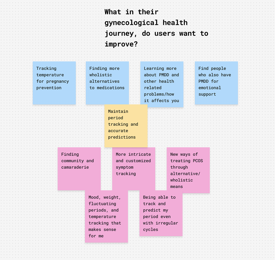
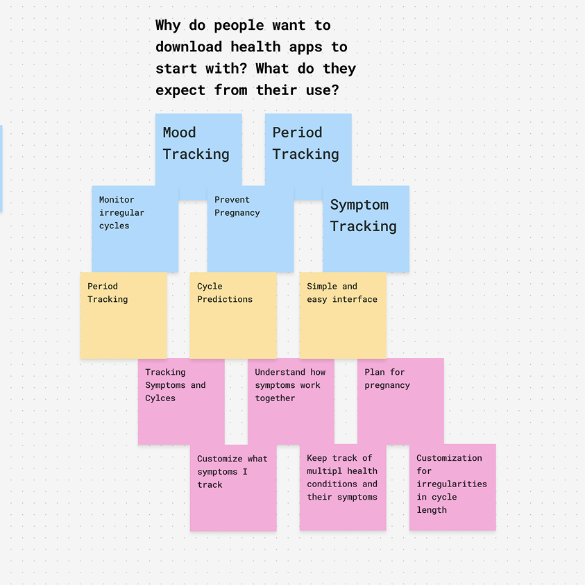
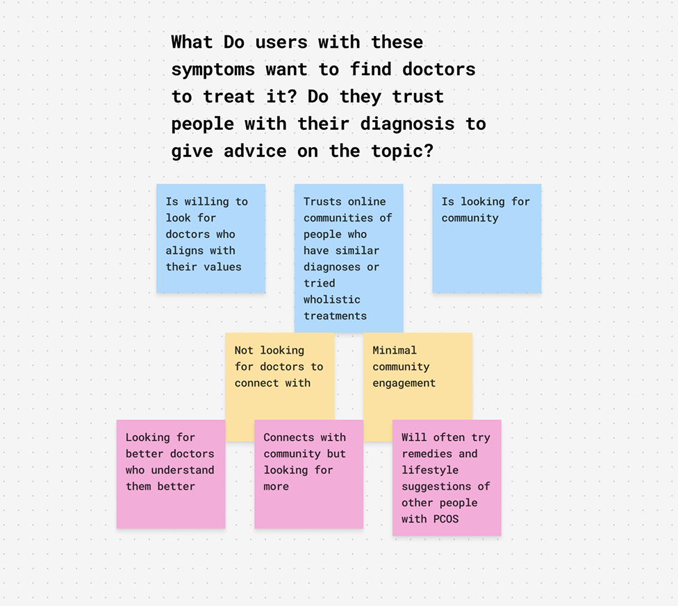
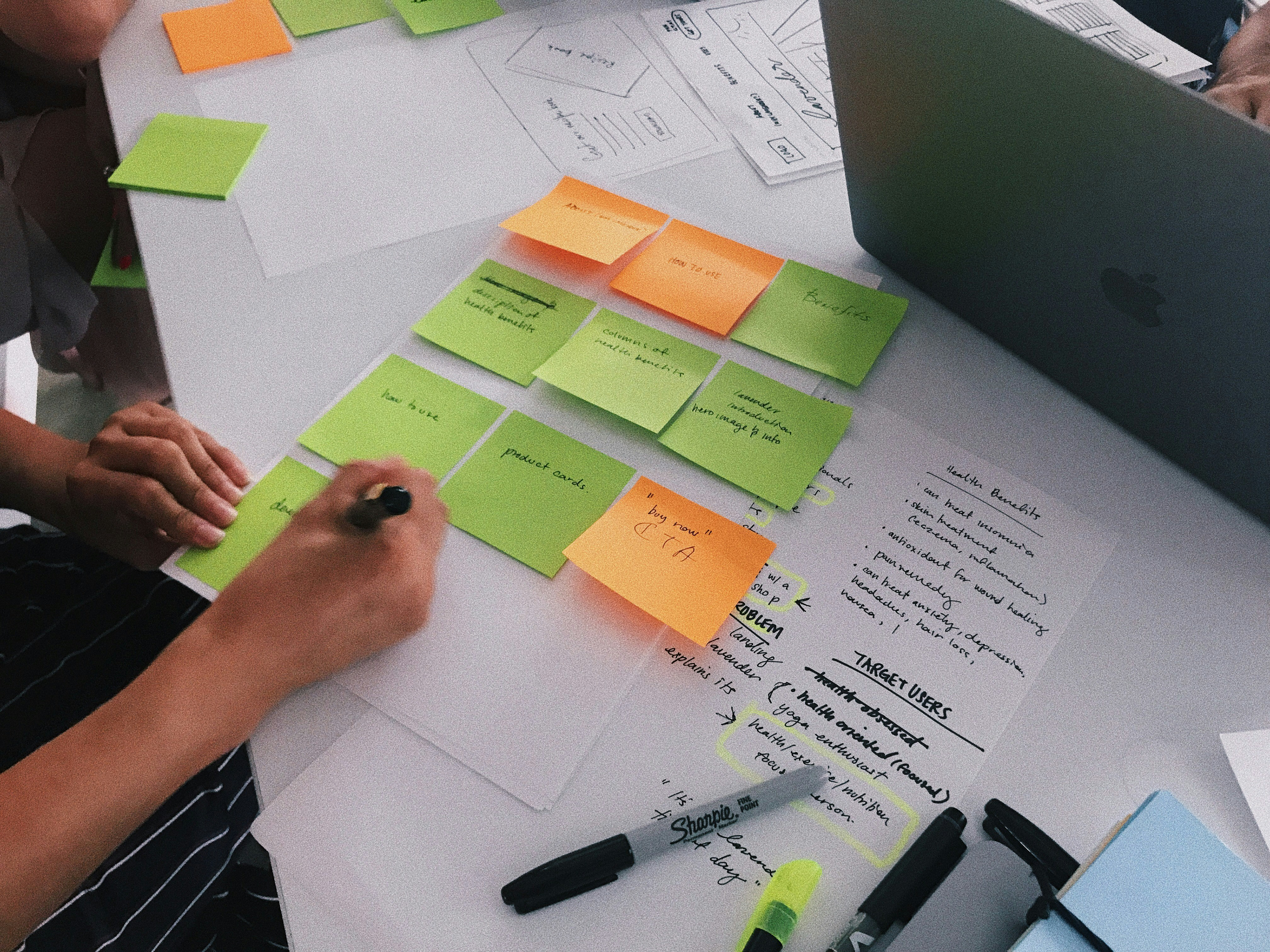
Affinity Mapping Results


Card Sorting
I conducted an open, unmoderated card sort exercise to gain insight into the minds of average menstrual health app users and understand how they would perceive previously organized content. Participants were given a list of 20 words and were instructed to categorize them in any way that made sense to them and name the categories. Many participants sorted the cards into very similar categories. The most common difference between my previous organization and the results of the card sort revealed was that many participants would group the period calendar data/inputs and the symptom data/inputs in the same category.
Card Sorting Results
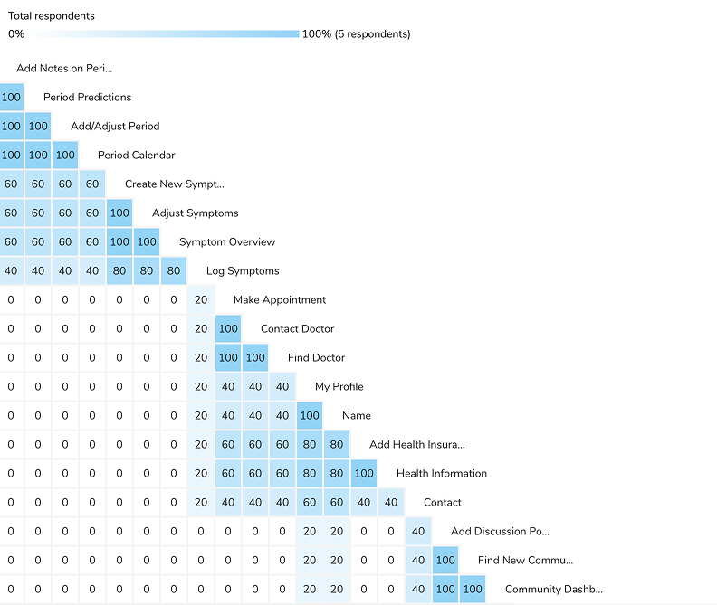
Users sorted the cards into a range of 3-5 categories, often given similar names such as period overview, period, or period information. Due to the popularity of period tracking apps, users have come to expect a certain layout and functionality of period apps, and many of them are organized very similarly. To not disrupt the expectations of the user, and confuse or frustrate them with a reworking of a previously established system, I chose to create an app that follows this system. The results of the card sort reflect that users do expect this and would organize it similarly.
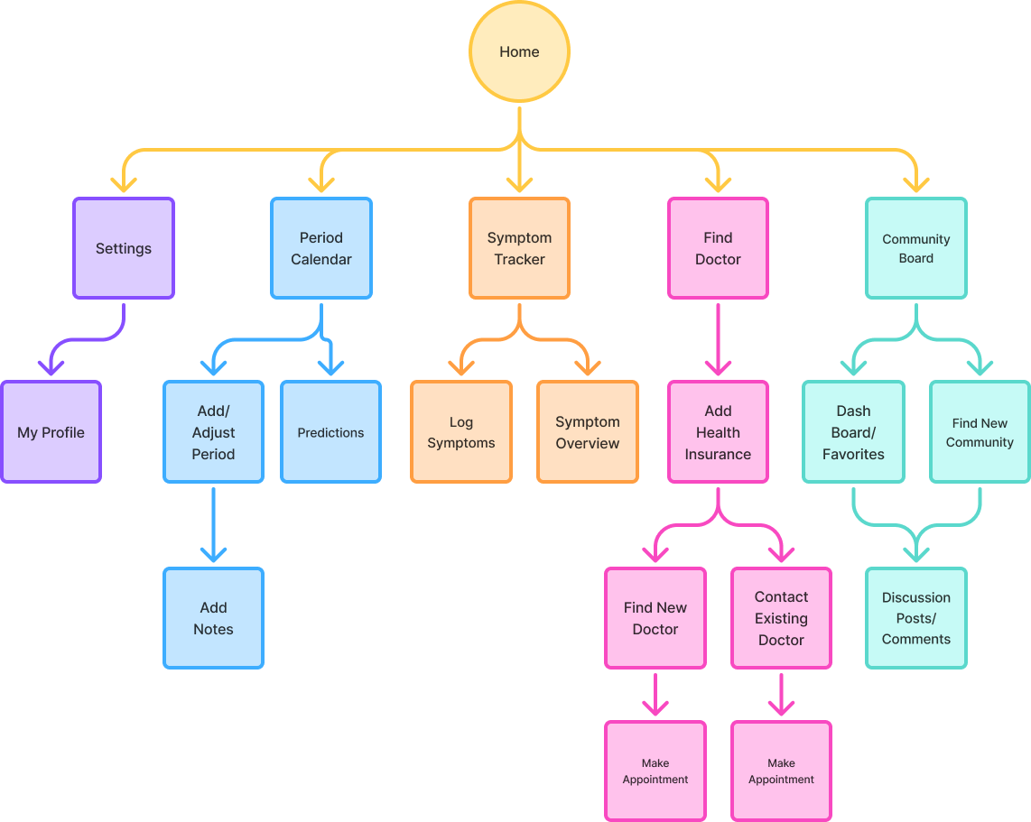
Site Map
4. Prototype
Low Fidelity Wireframe

High Fidelity Wireframe
Style Guide
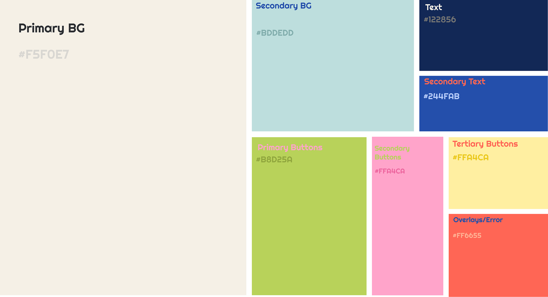
Primary BG- used for all page backgrounds once in the app.
Secondary BG- Only to be used as a background for login, splash screens, or cards overlaying the primary background.
Text- to be used as the main text color throughout, except when the text is used as a CTA or other large form text.
Secondary Text- used sparingly to lower the hierarchy of certain text or buttons.
Primary Button- Used as the color of all main focus buttons, which the user should initially be looking for on the page.
Secondary Button- Used most often in combination with primary button colors on a page when a second action could be taken.
Tertiary button- For small buttons and checkmarks, often in groups.
Overlays/Error State- To be used as the primary color when overlays occur, such as side panels. Also to be used to indicate error states and caution proceeding.
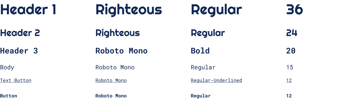
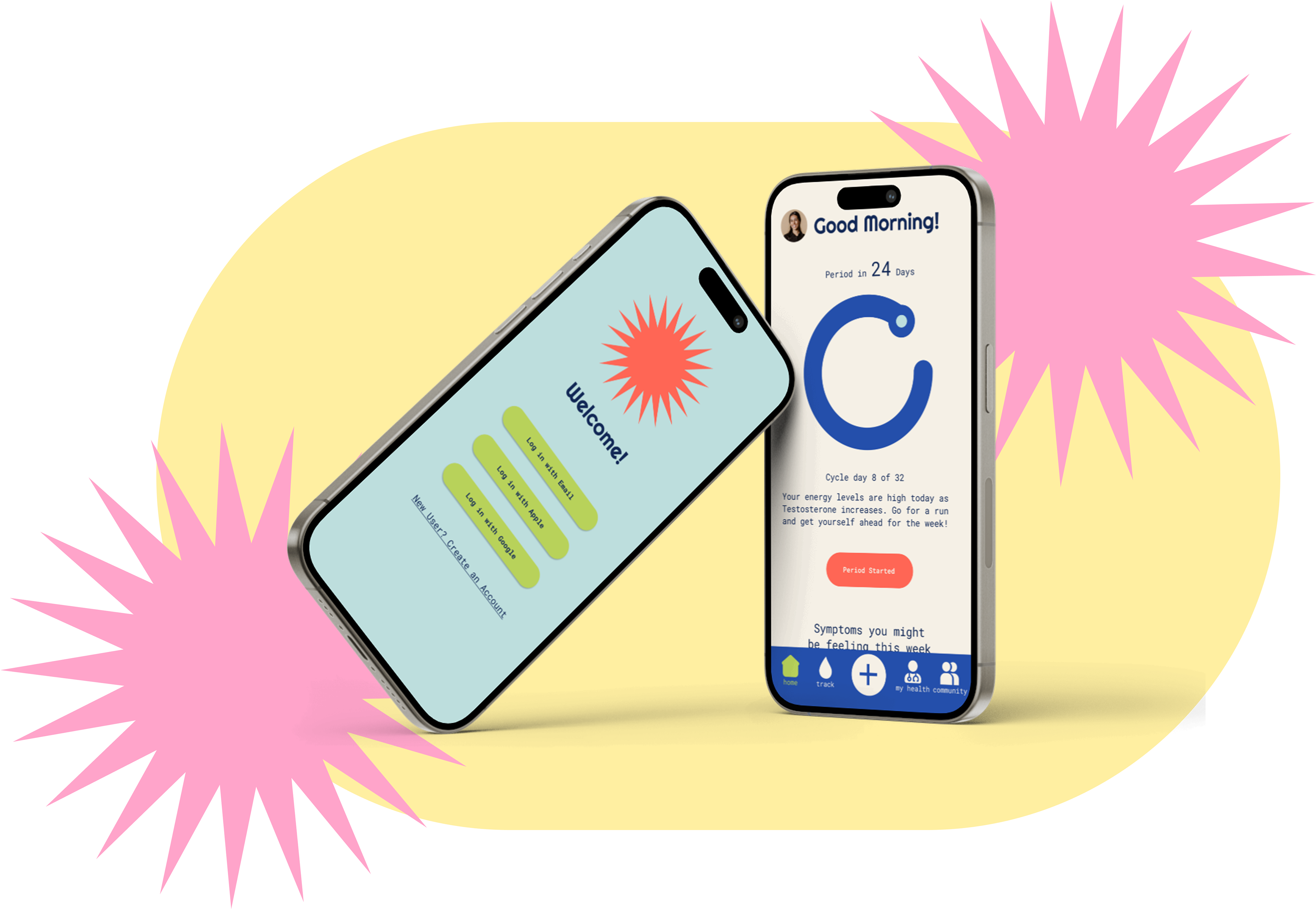
Retro-inspired fonts with even circular shapes but squared off ends help push the identity of Rizo by further displaying the balance of two extremes while remaining friendly and fun.
Designing for Emotional Engagement
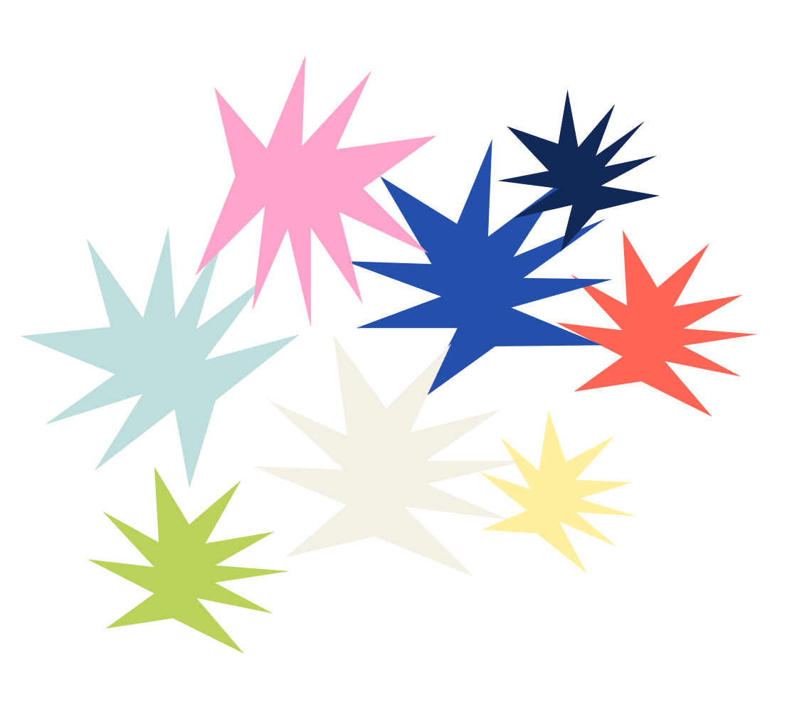
Creating a Story with Color
The fun, retro, and funky colors and patterns Rizo offers draw in its users to experience something new. Its bold design engages the user and invites them through its own zippy energy. The bold yet harmonious color palette is inspired by risograph printmaking techniques.
The fun, retro, and funky colors and patterns Rizo offers draw in its users to experience something new. Its bold design engages the user and invites them through its own zippy energy. The bold yet harmonious color palette is inspired by risograph printmaking techniques.
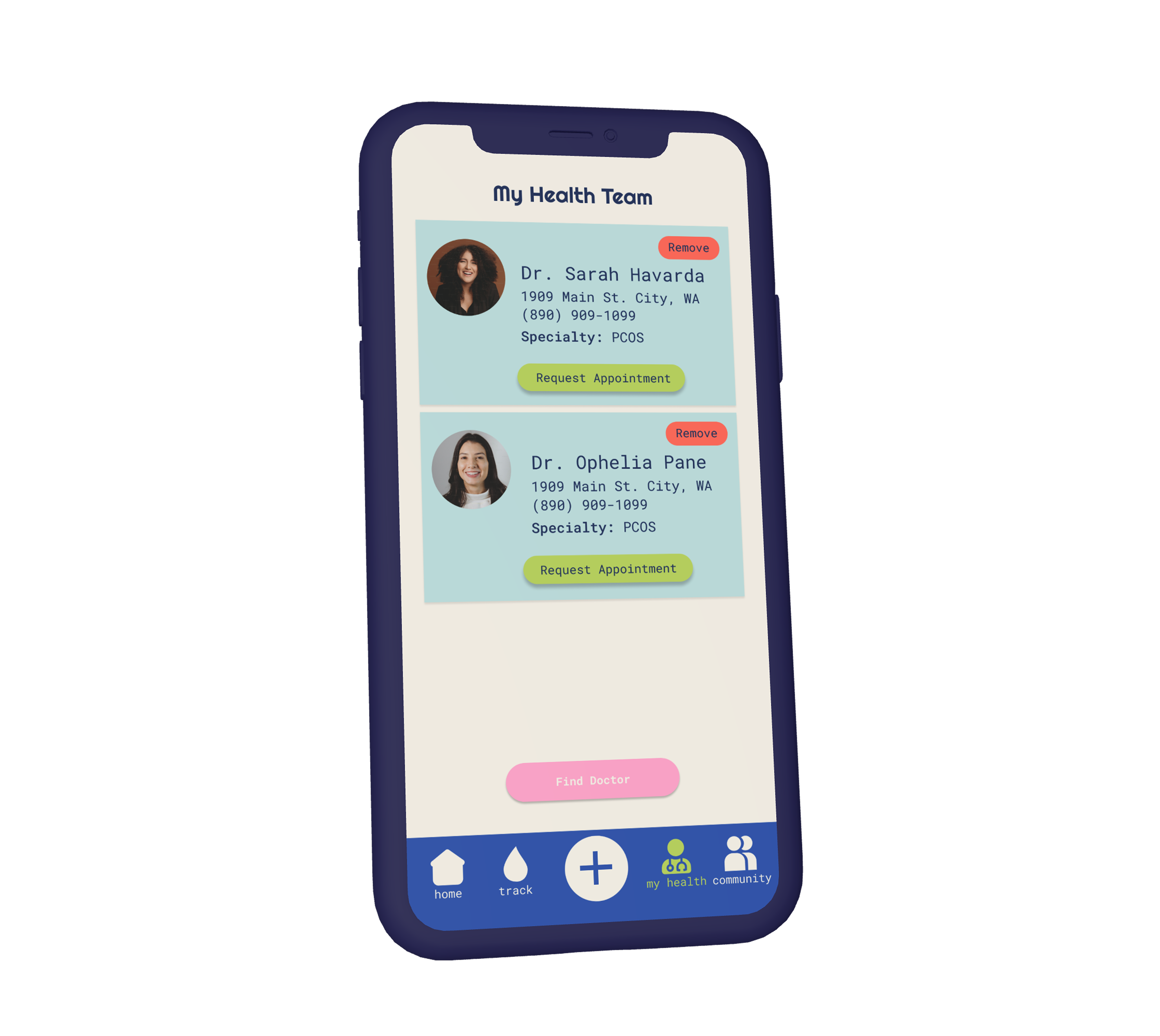
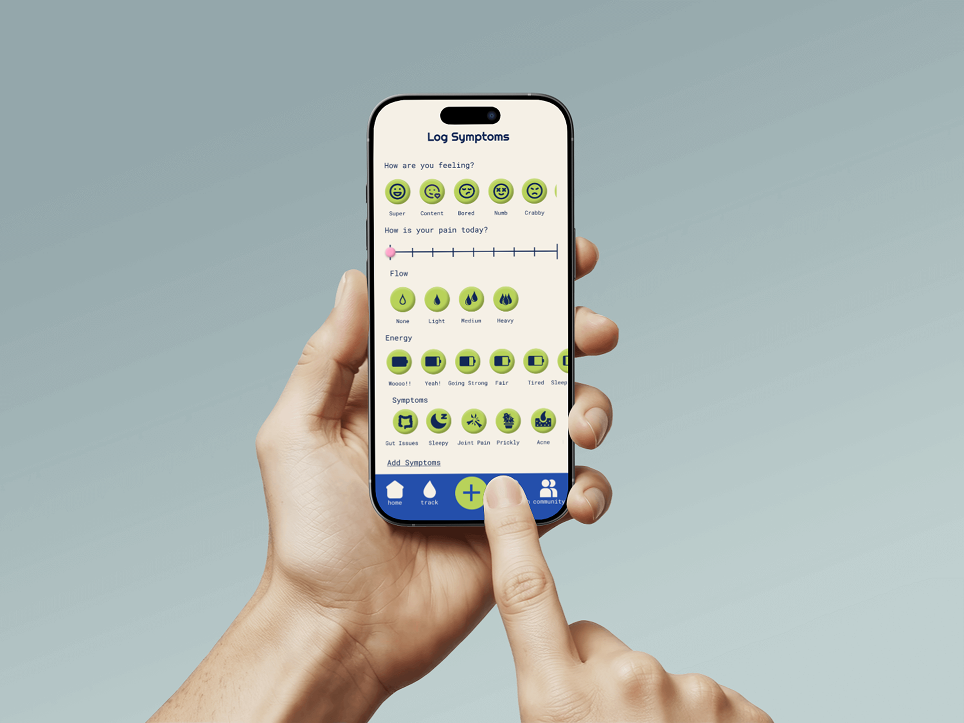
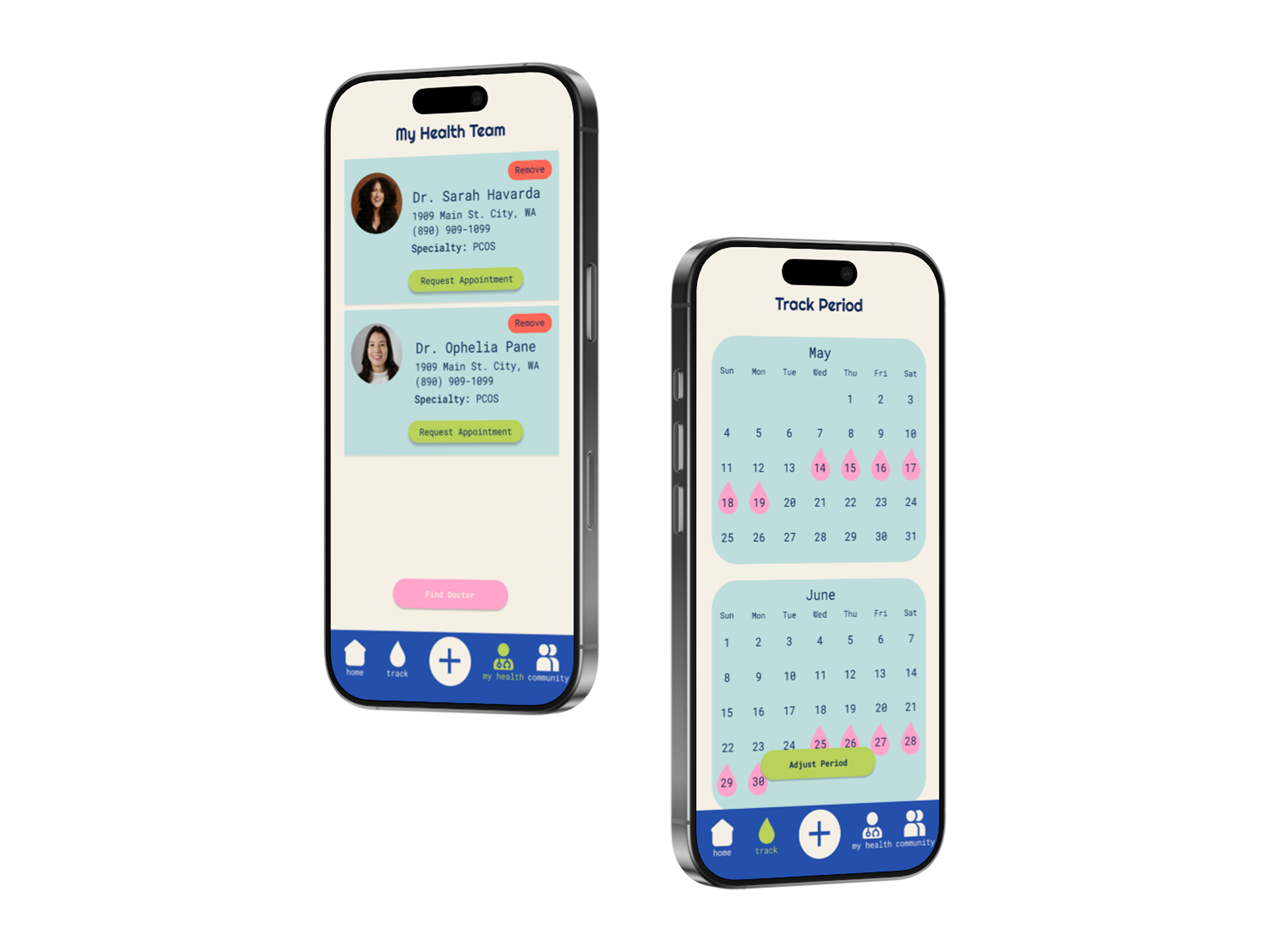
High Fidelity Prototype
5. Test
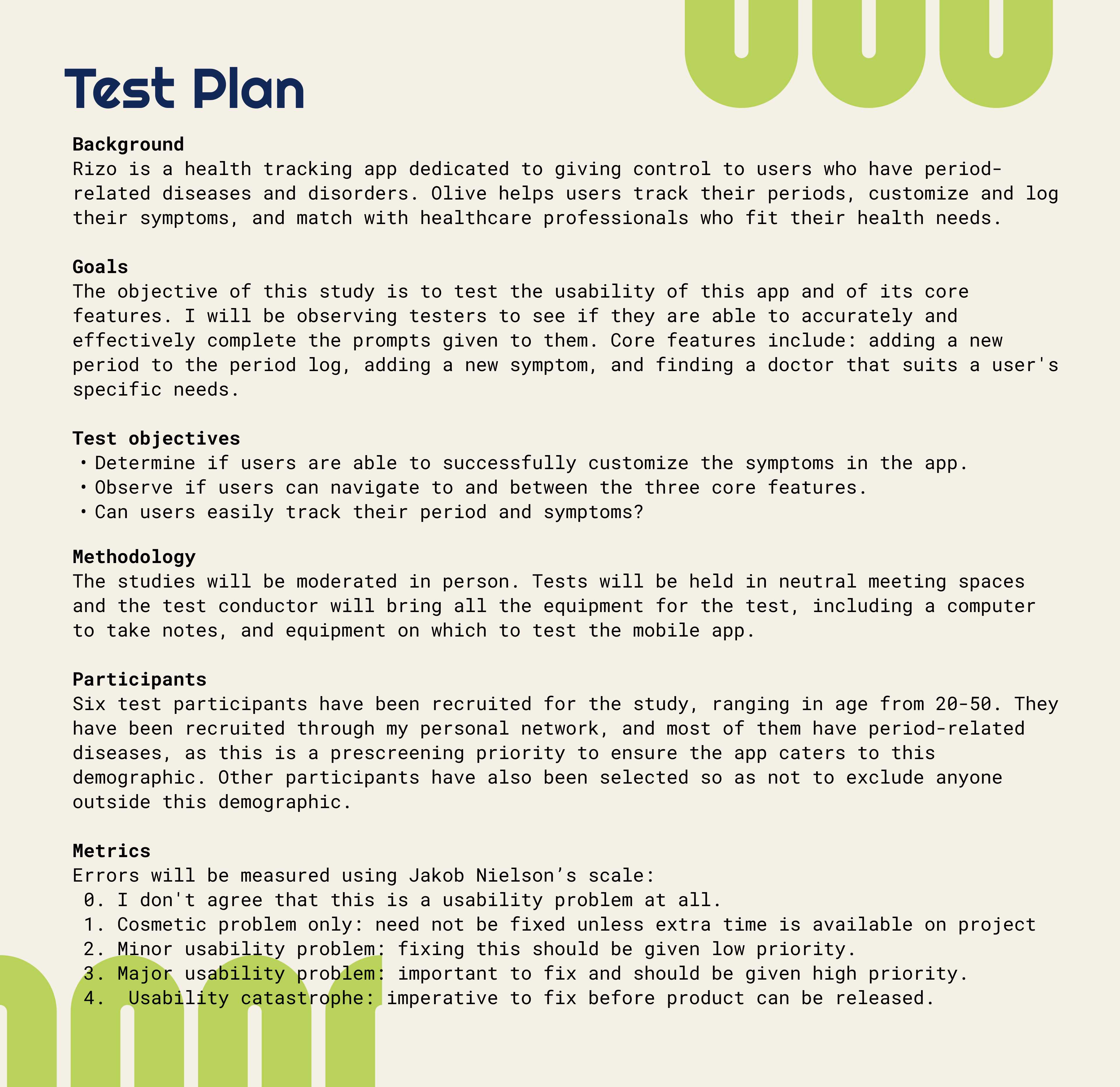
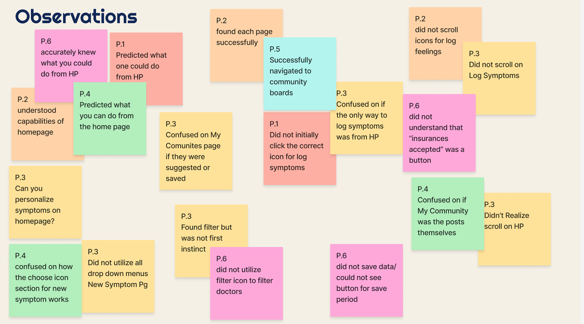
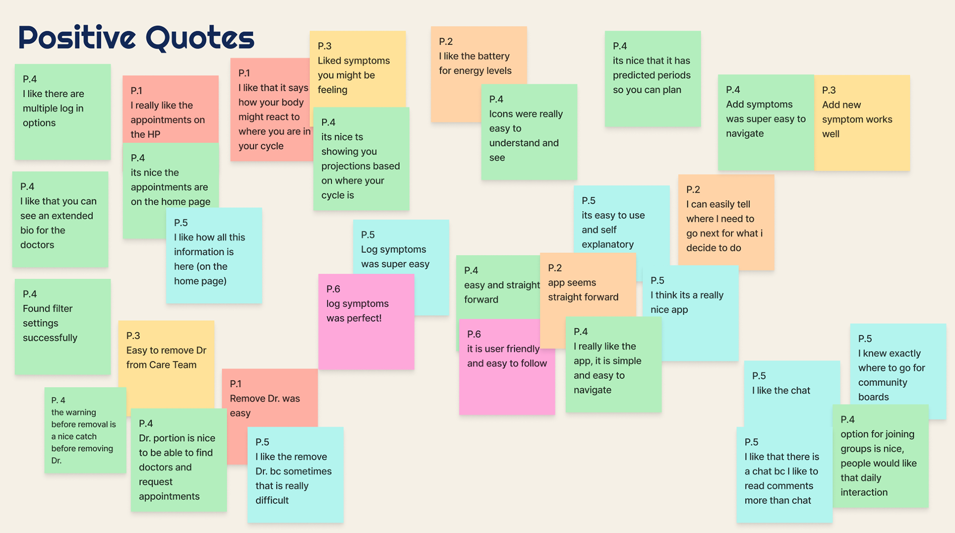
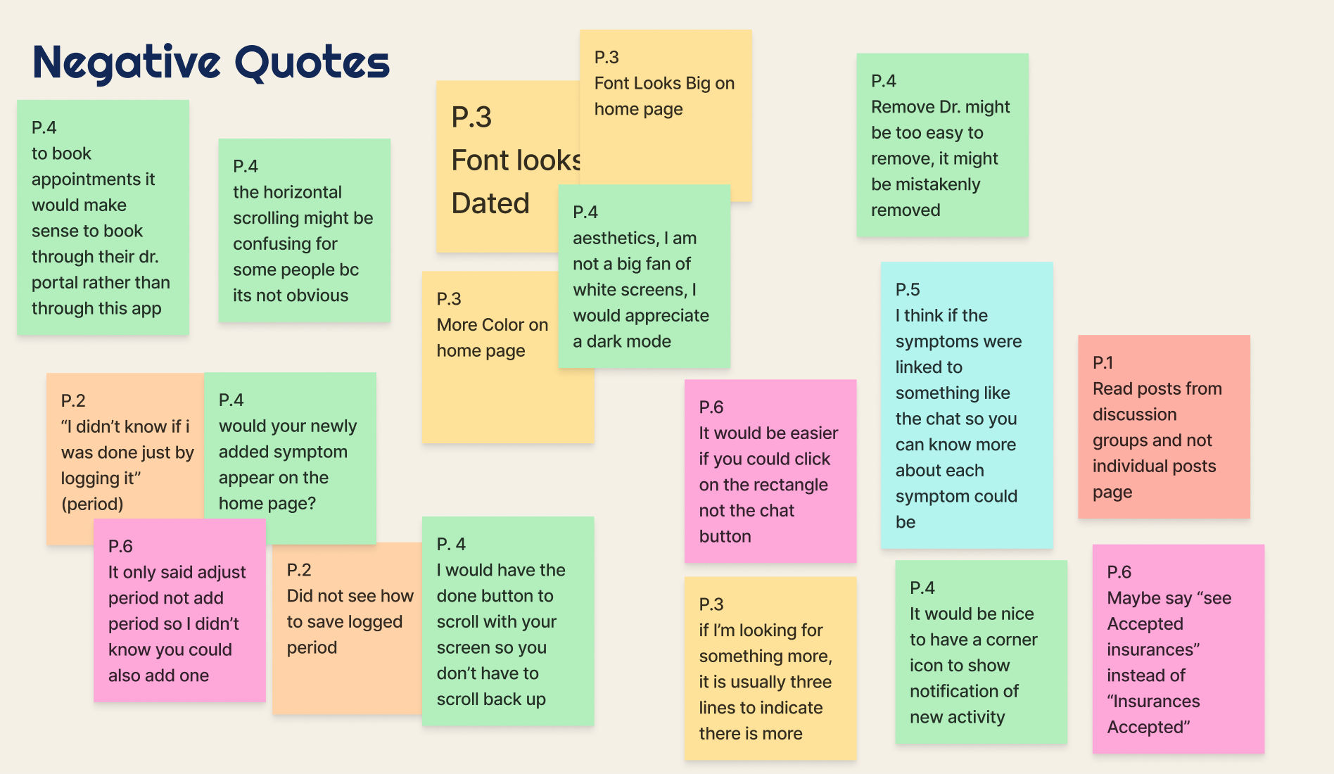
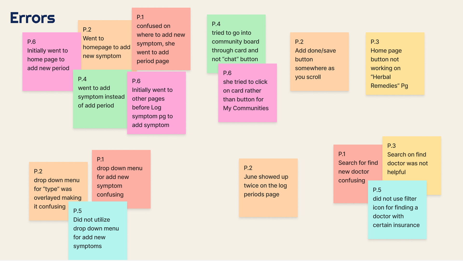
Usability Test
Affinity Mapping
Conclusion
The deliverables and scope of the project were all closely followed and referenced throughout the design process. This helped me to stay on track and maintain a strict schedule. By focusing on a more narrow user group, I was able to create a niche, largely un catered to demographic. Through extensive and varied testing, I created an app that appeals to this specific demographic, but does not exclude those outside. Additionally, the branding, tone, and unique features, such as community boards, set this app apart from its competitors.
Reflection
While multiple rounds of user interviews and various tests were conducted, if I had the chance to change something in my process during the creation of this app, I would have conducted usability tests after the low-fidelity wireframe was completed. This would have allowed more flexibility with major changes and could have encouraged a more creative and unique solution to certain user flows.